


[Art Schooled] Greg McIndoe says “Ciao” to his first competition brief
My first day at art school took place very much in the shallow end - mainly consisting of drinking and chatting. My second however threw me in a little deeper.
I know I said this new column wouldn’t be a day-by-day account of my life at art school, but this second instalment does pick up a day after the last one. I promise there will be time jumps. Otherwise it’ll be Christmas and I’ll still be obsessing over September.
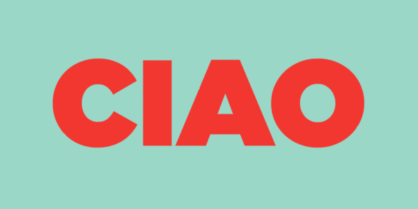
On our second day, we were handed our second brief. This time it was a competition set by Tapirulan, an Italian cultural association who represent illustrators. The brief was simple…“to create a square illustration, based on the word ciao”.
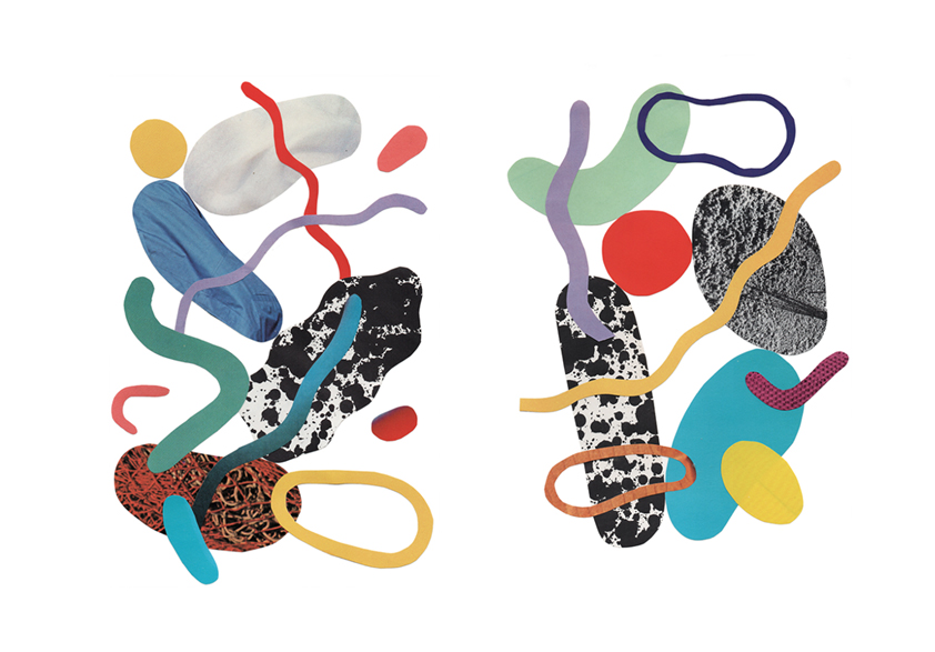
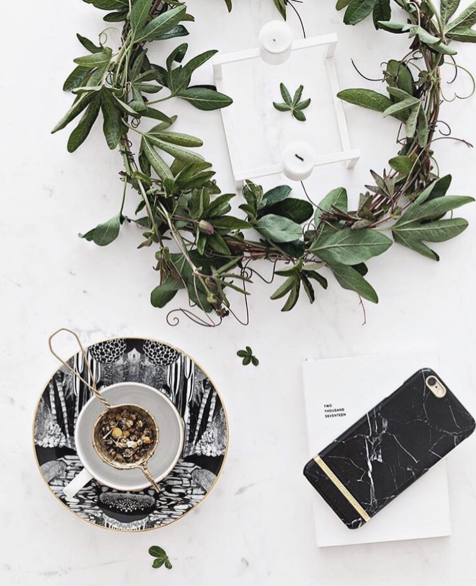
These beautiful collages by Saskia Pomeroy were part of my artist research.
The brief sent ripples of excitement through the class. Though the mood changed when the deadline was announced – 3 days time. This was Tuesday; we have a study day Wednesday’s (it’s sports day apparently!), a different project to work on Thursday’s, and then Friday was the hand-in. Basically, we had one full day of studio time to complete the brief.
“The brief was a good one. Vague enough that it could be interpreted in countless ways but not so vague that you didn’t know where to start.”
I’m aware that 3 days for many real life briefs is generous. I’ve read many accounts about illustrators being given less than 24 hours to turn something around for a big client like The New York Times. Realistically three days was plenty of time. Because it was the first deadline of a new course though, it really didn’t feel it.
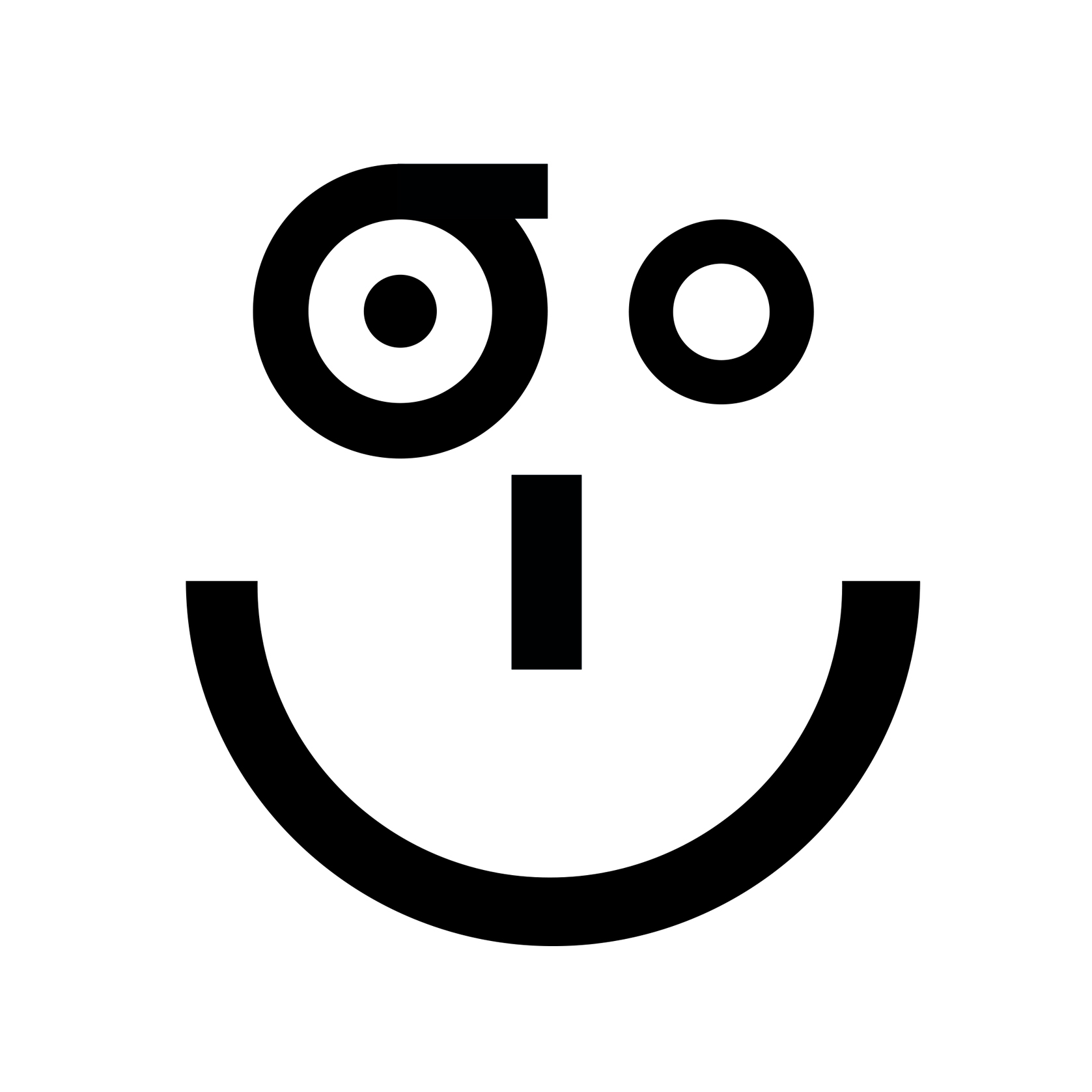
With this in mind we were advised to “play to our strengths” and create something using skills we already possessed. We were assured there was plenty of room for wild experimentation whilst on the course but this was not the time for it. Although clearly illustration is now my focus I have previously studied Graphic Design. So, taking this advice on board , I decided something simple and typographic was my best bet. I looked at the work of Saskia Pomeroy and Olimpia Zagnoli for a little bit of direction on how to keep things simplistic yet lively.

Olimpia Zagnoli was one of the artists I looked at during my research
While today had started just like the first, when we got back to the studio the atmosphere was distinctly different. The “tight” deadline meant that – while a degree of random chatter remained – it was interspersed with bouts of intense silence. We all focused, trying to figure out what we were going to do to meet the brief; and indeed meet its deadline. People’s working rituals also began to emerge. Some needed music to brainstorm to. Others needed Netlfix (Men In Black 3 is apparently motivational viewing?). Others require brain food in the form of space raiders. Though it felt a little more stressful than on our first day, it was nonetheless more exciting to finally be getting stuck in; the environment felt immediately more creative.
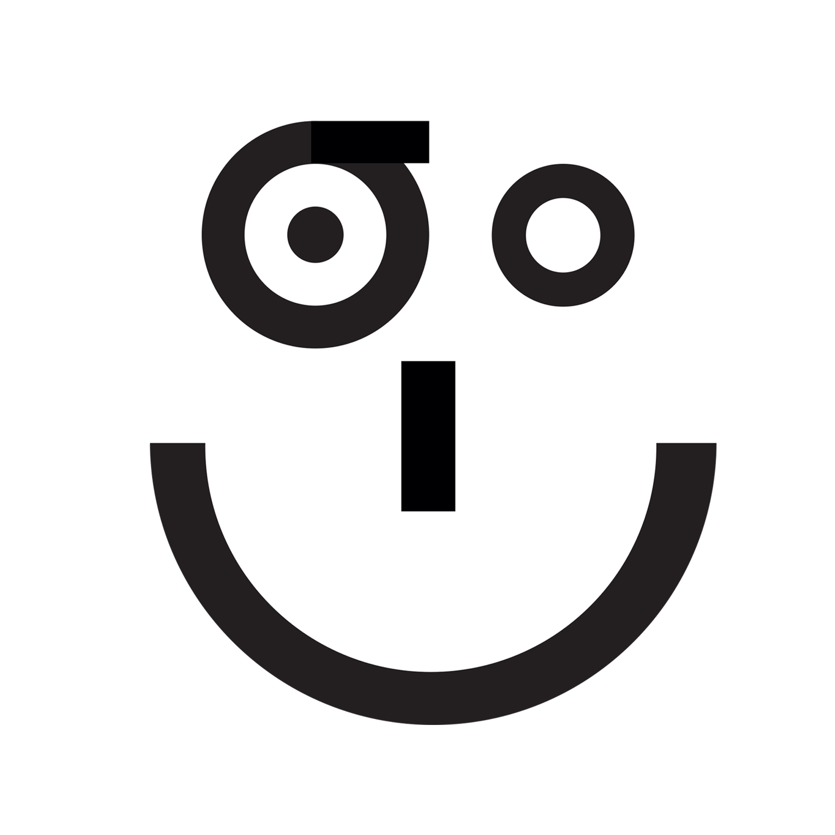
After an intense period of mind-mapping (a process I have grown to love, after much initial resistance) I decided to focus in on the fact that “ciao” had become a universal way of saying hello. Playing around with the four letters in the word, I decided to play with transforming them into a typographic face – making the already widespread greeting even more universal.
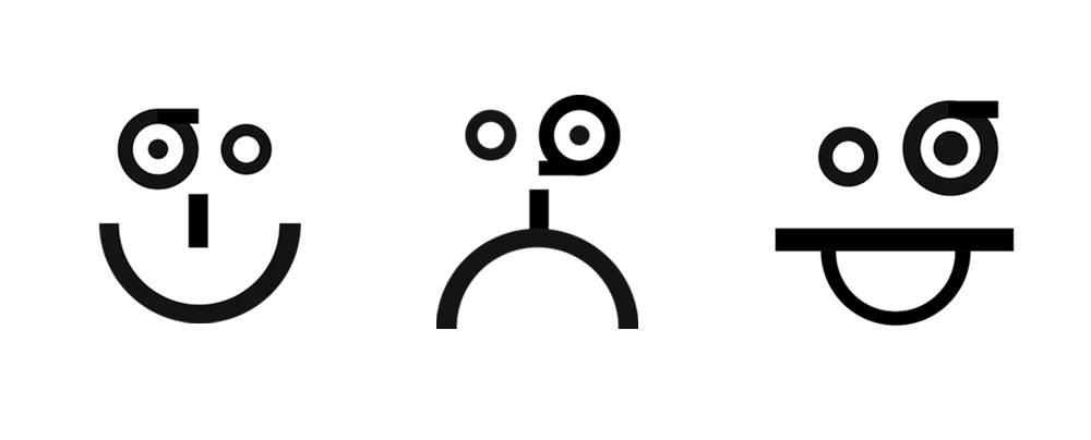
Examples of the typographic face, created using the letters from the word “ciao”
This part of the process didn’t take long, and I was pretty happy with the idea. But then I was struck with creative block. Where next? I liked the ideas simplicity and thought it would be perfect screen printed or risk-printed. However, given that our induction’s for these facilities don’t happen until week 5 or 6, this didn’t feel like an option.
After playing around with different compositions, I chose the smiling “ciao” face
This frustration led me to doing something a little odd and off the cuff…introducing a wolf. Whilst there was a train of thought behind the wolf (it’s Italy’s national animal don’t you know?) it was, in hindsight, a panic move. I was panicked that my initial typographic idea was too simple, and that I had completed the task too quickly. Perhaps the wolf would be the solution?
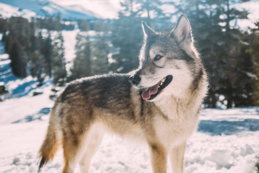
Photograph by Robson Hatsukami
Did you know wolves were Italy’s national animal?
Another reason for the furry addition was my worry that the graphic logo looked too much like a graphic designer’s submission, as opposed to an illustrator’s. Since deciding to switch specialism wanted to show that logos weren’t all I could do. Of course there is naturally crossover between specialisms but being in a room of people all of whom can clearly draw VERY well, it is easy to let your brain trick you into thinking you have something to prove.
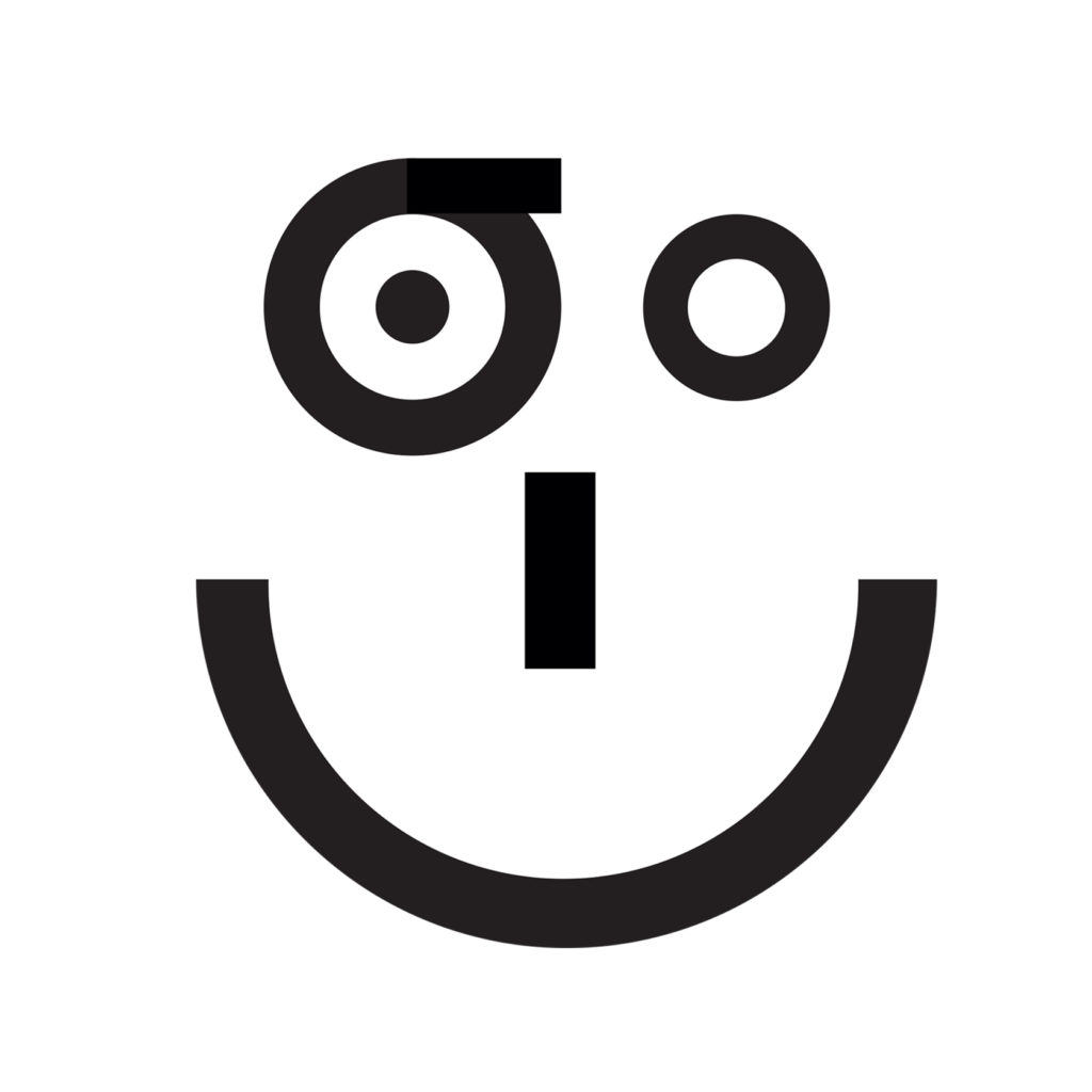
I’m over explaining it now but the wolf was added and I was pleased with the final piece. It didn’t feel too typically Italian as I had avoided Italian stereotypes and I loved seeing the look on people’s face as they found the word “ciao” within the smiley face. The proud feeling of coming up with the idea of a universal ”
What had faded in a much shorter space of time was my confidence in the wolf. Both the wolf and the icon made sense separately but weren’t really linked in any way. And, although I liked it visually, it felt like it was confusing the concept. This only really dawned on me after I had had my final piece printed and people started asking me to explain the piece as a whole. It was too late now, I would have to just go with what I had – wolf and all.
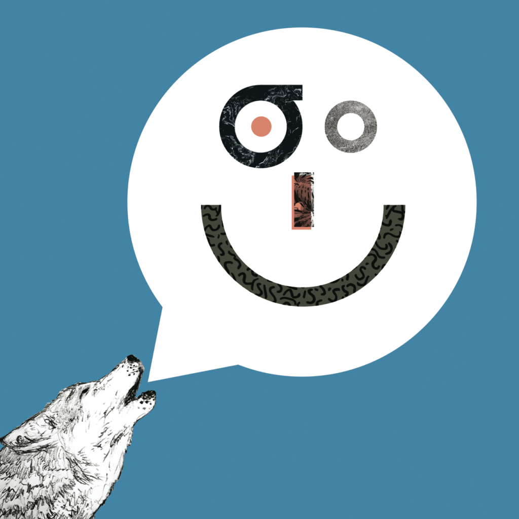
My final piece for the “Ciao” competition brief
It was the morning of the group crit. I expected that there might be quite a few similar trains of thought, but I couldn’t have been more wrong. There was everything from from gold leaf illustrations based on the glamour associated with Italy, to bold colour-led tissue paper collages based upon the sound of the word ciao. I was relieved that there weren’t any typographic smileys, and (perhaps a little less surprisingly) any wolves in sight. I think we were also all relieved to see how informal the crits were. This put us at ease and making it much easier to give and receive constructive criticism and feedback.
Because the the brief came from a current, live competition, we actually have about four more weeks during which we can refine our ideas and make a submission; and I fully intend to. I plan on stripping down my idea, to just the face and play around with colours and textures instead of wildlife.
“Today’s lesson is this – if you are unsure if you’re image is strong, don’t just slap a cute animal on top it.”
Now I can’t promise there will be a lesson to learn from each column, but this week there is. I am the world’s worst procrastinator so there is every chance I will come back and read this one day when I am distracting myself, so it can act as a reminder for me too. “Today’s lesson is this – if you are unsure if you’re image is strong, don’t just slap a cute animal on top it.” It might sound obvious but taking one cohesive concept and one fun fact and mashing them together does not make for a clear final outcome.