

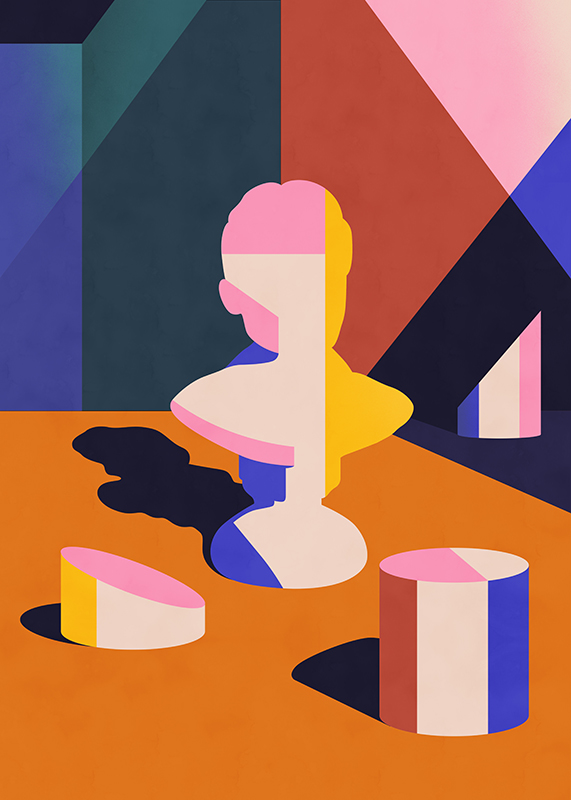
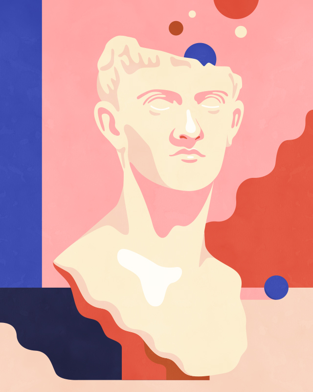
Illustrator Petra Ericksson reveals her tips for mastering the art of colour

Swedish illustrator and artist based in Barcelona, Petra Eriksson describes herself as a compulsive drawer and professional tea drinker with a love for dots, bright colours and confetti.
Represented by Handsome Frank, her works plays around with shapes and colours to create an interesting balance, often mixing graphic flat shapes with something more organic and using a mix of cold/warm/dark/light colours. She has created campaigns and editorial illustrations for the likes of The New Yorker, Apple, Google Creative Labs, The New York Times and more.
Here she shares his pro tips for using colour to create striking illustrations for clients.

How did your visual style develop? Where do you get your ideas and inspirations from?
My style is something that I feel has been developed through producing a lot of pieces during many years and through that process finding my way of expressing myself visually. That said, I think it’s a constantly ongoing journey. I don’t want to do exactly the same thing all the time and I think we subconsciously pick up things along the way that tweaks our style slightly over time.
 Can you describe your main influences?
I feel like influences comes from everywhere. Patterns in nature, clothes, colour combinations on walls covered with layers of different street art pieces, people, great stories in books and films etc. But some inspiring people that I keep going back to are:
– Iris Apfel, for her creativity and energy to be playful with her style, never being afraid to mix patterns and colours in ways that most people wouldn’t dare to.
– Hayao Miyazaki – the legendary director/animator/illustrator/ of Studio Ghibli who really knows how to use colours and how to use images to enhance the story he’s telling. I also love how blurry the line between reality and dreams/surrealism/parallel universes are in his works (and in many other anime/manga works) which is something I like to play with in my own artworks as well.
 What do you think are the key qualities that make for a strong and captivating illustration?
I love when someone manages to create a really strong conceptual illustration and also manages to do something that is balanced and interesting when it comes to layout and colours. Though I definitely think that illustrations can be great even if it doesn’t include all of those things. I admit that I’m not the most conceptual person (which is something that I’m both trying to develop and also just accept) and I definitely think that there are still a lot of qualities in work that are just visually intriguing. Something that captures your eye and supports the context in which it’s in.
 Which tools or techniques do you use? Can you describe the process of building up layers of color / tonality to evoke specific atmosphere, mood or emotional response?
I don’t have any specific technique for these things but I often start by thinking about what kind of feeling I want the image/illustration to have and how I can use shape and colour to help me create that. If it’s something that needs to reflect some kind of calmness I’ll probably end up using more colder colours, and maybe some that are more tuned down like in The Last Days of Summer piece. Also opting to not use as many different colours and use one big background shape to create a sense of stillness. You can compare it to the Fast Food Wasteland image where I wanted to create an slightly messy and more energetic image by working with brighter colours, more shapes and a greater mix of warm and cold colours. That said, I still find it very important to find some kind of balance in all the artwork I create, but balance can be created both in a more “messy” image and one that has fewer objects. Actually, sometimes I feel like it can be easier to build an interesting composition with more objects in the image, using these shapes to bring the eye back into the image, while if you work on a simpler composition the placement of every little shape needs to be exactly right.
 With reference to a recent project, can you briefly talk us through one of your well honed techniques for using colour?
A recent project I worked on is Boundaries, which is part of a series of images prepared for an exhibition. The whole series works a lot with the theme of protecting oneself/hiding/running away from things that are uncomfortable, and how the line between these things can sometimes be blurry. This piece depicts a person hiding behind layers of these wavy shapes, wishing not to be seen. While creating this I felt like it was important that the face is almost hidden, giving it a dark colour that almost melts in with the black background. I wanted the viewer to see the waves first and therefore they needed to be brighter to stand out more, some of them are also used behind the person to make her just slightly more visible. Over all I worked on balancing the colours to create an interesting combination, using cold but bright blues and pinks with warmer yellows and terracotta coloured waves as well as some more tuned down off whites and greyish greens.
 How do you approach colour as a tool for creating work? At what point in your creative process do you start thinking about your colour palettes?
My work circles so much around colour combinations so for me I start thinking about colours very early in the process. I usually get a sense for some of the colours I think will suit the piece when I start with my first raw sketches or maybe already when I’m reading the brief. That said, I don’t always stick to these initial colours thoughts but that’s usually my starting point. Colour is very emotional for me so I think that whatever feeling I get when starting with a project definitely affects which direction I’m going with for the initial colours.
Usually I might start with thinking about 4 main colours and then I know that I’ll most likely add some more colours for details later on. Usually those initial colours include something really dark, something very light and two mid tone colours that complement each other, like a very dark blue, a light off white, a mid tone blue and a slightly lighter terracotta colour to include something warm to the otherwise cooler shades.
 For creatives who are interested in playing with colour, can you offer a trick, a tip or piece of advice to get started?
When I was in art school (MANY years ago) we worked a lot with colour theory while painting which I definitely feel is something that has helped me when it comes to how I approach colours now, so I would say that for anyone who’s interested in learning more it’s great to get a simple set of acrylic colours and do some colour theory exercises. Just by painting a colours wheel and understanding how the colours opposite each other (like blue and orange, purple and yellow, red and green) in the wheel works together and also take each other out if being mixed is a good way to start thinking more about how colours affects each other. Knowing that they create a grey colour when mixed but help each other stand out when put next to each other is something that I think might be helpful to try out if you haven’t already done so.
Extracts from this post feature in How to choose a colour palette written by Lisa Hassell and published by Digital Arts, Oct 2019.