Tasting Type Like Wine: An Interview with Sarah Hyndman

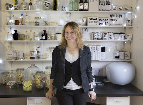
Sarah Hyndman is a graphic designer and author known for her interest in the psychology of typography, and founder of experiential type studio Type Tasting.
As we prepare to welcome Sarah on stage at Glug Birmingham next month, we share extracts from her recent interview on extensis.com, part of their series of conversations with thought leaders in the world of typography and type design.
Here Sarah talks about her work as a researcher and graphic designer, how she’s able to predict how you take your coffee, and more.

Sarah Hyndman
Thanks for being with us, Sarah! Let’s start by talking a bit about your history. How did you originally come up with your project Type Tasting?
At school I studied sciences, but my very first job when I left school was working for a sign-making company. I moved to London and after starting off as a Mac operator, and moved my way up to graphic designer. I ended up running my own design business for about ten years. Around that time I reached that point that I think a lot of designers do, where you need to just go and refresh your enthusiasm, refresh your skills and your knowledge a little bit. Originally it was my idea to do a year off, or a gap year, just to do something completely different—but it ended up lasting a bit longer.
What kept coming to mind was: If only I could explain this to people, but in a fun way—in the same way that you might go to a wine tasting, as opposed to, say, a lecture.
Originally, Type Tasting was based on the idea of wine tastings. Within the design industry, obviously designers understand what typography is, but I was finding that the minute I talked to non-designers, or clients, or even friends, I would find that there was a disconnect between the language I was using and their general understanding. What kept coming to mind was: If only I could explain this to people, but in a fun way—in the same way that you might go to a wine tasting, as opposed to, say, a lecture.
One of the really early things I did was, to start conversations about type, I would ask people to start by describing a typeface as a food. So if Helvetica were a food, what kind of food would it be? If Comic Sans were edible, would it be sweet or would it be savory? This worked really well with the name Type Tasting—but it then opened up all these new and intriguing areas of interest. I discovered that there’s actually a whole science to this—crossmodalism, it’s called—which, once I started reading the research, I realized: ‘Ah, maybe I could look at typefaces and see how they actually influence your other senses.’

Typeface: Balega
Can you say more about cross-modalism?
The term ‘cross-modal’ literally means that when you experience something with one of your sensory modalities, as the scientists call it, it then crosses over and has an effect on another one of your sensory modalities. And this happens incredibly instinctively. So if I say, ‘What would yellow taste like?’ What do you think it would taste like? Well, in fact, if you look at the shade of yellow, apparently you’re likely even to start salivating, because your brain automatically imagines the flavor of lemon.
When we were hunter-gatherers certain associations were coded into us to keep us safe, and for our protection. Our brains warn us very instinctively.
This goes back to very, very primitive times. When we were hunter-gatherers certain associations were coded into us to keep us safe, and for our protection. If you saw something that was round and red, it was likely to be safe to eat, and in fact it would be nutritious. So now when you see round things, your brain assumes, ‘Oh, that’s sweet,’ whereas if you see something that’s angular or jagged, it’s likely to be dangerous, or unripe, or it may taste bitter. Our brains warn us very instinctively.
There are two very distinct levels to this, however. On an incredibly primitive level, we know to seek round shapes and avoid jagged shapes—but we learn very quickly to override these with other associations. An object is only neutral the first time you see it. Once you’ve seen it, you’ve learned a new set of associations, which you will then remember. With food these associations are quite powerful, because we’ve been taught certain responses through food packaging. With type, if you saw a typeface for the very first time, if you’d never seen that style before, you would make some very natural assumptions. But if you had seen something similar before, you’d match it intellectually to the other instances, the other contexts, you’ve seen, using your learned experiences.

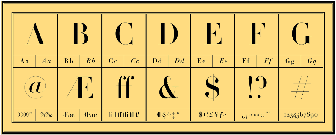
Typeface: Didot
Do you have an example of a font or a typeface that came out recently, the response to which you might have predicted?
The thing is, no font is ever seen out of context. The typeface will always take on the values of the brand, especially if it’s a really famous brand. When the new Google logo came out, for example, a lot of people had an opinion—as you might have noticed! To my mind, and to a lot of people I talked to, it looked quite childish, quite simplistic. If it hadn’t been Google, if it had been somebody that you’d never heard of before, then from the childish shapes of the logo you might have assumed it was a child’s toy company.
But you’d really never ever see the Google logo in isolation. You’d always know that it’s the Google brand—and they have such strong brand awareness, it will be applied to the logo in the minds of anyone who sees it. By now that logo has become almost invisible. It’s so much a part of the Google experience that it’s essentially assimilated. If the values are bigger than the associations you put on the typeface, the typeface will gain this whole new set of associations.

Typeface: Olympics 2012
What are some other examples of fonts that effectively convey specific experiences?
Well, again, a font can never be separated from the way it’s used. So say you want you brand to look prestigious, luxurious, expensive. If I suggested you use, say, the typeface Didot, which is always associated with luxury, but then you went and printed it at 50 points in hot neon pink on a yellow shiny background, it’s not going to look prestige at all.
One example that, as a Londoner, springs to my mind, is the 2012 Olympic typeface, which was very angular. When it was reproduced on the boards that were all around London at the time—probably six foot, eight foot tall—these looked really, really powerful. A lot of people commented that they felt energetic, but they also felt quite aggressive. I think we were really lucky that the sun came out for the Olympics. That made London a really happy place, and we won a lot of medals. I think if it had rained the whole time, if it had been gray and gloomy, these large angular letters would actually not have improved the optimism of London at that time. I think they would have created a negative vibe.
You claim that you can predict how someone will take their coffee. Can we pull the curtain back a little, and ask you how you do that?
I do lots and lots of experiments and research. This is an experiment that’s really good fun to do live, but it’s also an online survey: I ask people to match different flavors and qualities of coffee to different typeface shapes. As the survey has now had quite a few thousand people do it, I have now got quite a comprehensive list of typeface shapes that I can match to the different ways you take your coffee. So I can say, ‘Pick one of these typefaces,’ and match that pick to the results.
There’s two levels to it. First, there’s texture and flavour. So if you like quite chunky, curvaceous writing, I’d guess you also like a quite rich, full-fat cappuccino. But then, if you say you like fairly light typeface, for example, I know those light typefaces are usually associated with quality, so I can say, ‘Ah, you like expensive coffee, do you?’ The funny thing is, when I do this, 85-90% of the time people say, ‘Yes! Wow! How did you guess?’ It looks like magic, but it’s not.
Type is like clothes: what face you use depends on the when and where. When I’m writing or doing a lot of my work, I will use faces that are quite neutral because I find, referring to so many different typefaces, I want what I use to be quite understated.
The big thing about type is that all of us have been type consumers all of our lives. It’s like art, or wine. You don’t necessarily have to be consciously aware of it. You don’t necessarily have to understand the language or intellectualize how it works. But the reason it does work is that all of us have been learning these associations, and responding to them, all of our lives.
Do you yourself have any favorite typefaces?
Type is like clothes: what face you use depends on the when and where. When I’m writing or doing a lot of my work, I will use faces that are quite neutral because I find, referring to so many different typefaces, I want what I use to be quite understated. A lot of what I write is in Franklin Gothic, because it’s a sans-serif, so it’s fairly neutral; it doesn’t clash with anything else; but it’s still got the double-story a’s and g’s so it still has that feeling of being a little bit intellectual.

Typeface: Franklin Gothic
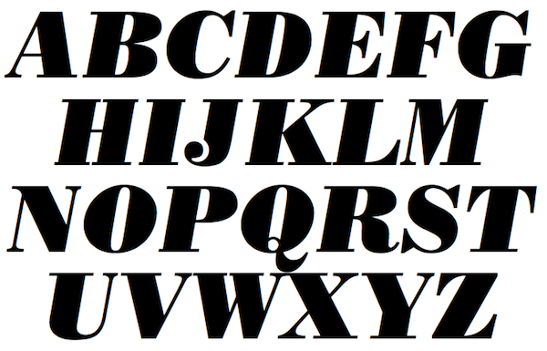
In terms of display typefaces, I like the chunky ones that have quite a lot of contrast, so things like Bodoni Poster Italic. There’s also a really nice one called Balega by Jürgen Weltin, which is kind of chunky and angular, so it looks really powerful, but it sort of reminds you that it might have a slight edge to it. It might ask you a question.

Typeface: Bodoni Poster Graphic
Can you talk a bit about the relationship between Type Tasting and the work you do as a graphic designer?
In an era when we’re asked more and more to bring data into the whole process, more of our responses are being measured than ever before. So being able to actually back up design decisions—never having design led by technology or research, but just having these extra tools, where you can explain, ‘This is why I did this,’ and put it into context—I think is really helpful. In other words, I use the research that I do both to inform and to back up my work.
A good graphic designer always has to play devil’s advocate. Ask questions, and know that it’s about what the client wants, not what they ask. Don’t ever just do the obvious when, actually, it’s worth exploring a little bit more.
Because I’ve been developing this work for the last 2-3 years, and I didn’t set out to define what I was going to do, it’s very much been an exploration. People think I can just recommend the miracle typefaces that will be a cure-all, and they can go away and use it for their branding. As a graphic designer, I know it’s the context of the whole thing that matters.
Sometimes I think being a graphic designer is like being a therapist or a business consultant. From the time we finish asking all the questions—‘What do you want to say?’ ‘How do you want to say it?’ ‘What do you want out of this project?’—to the time we are done with a design, the job can really change. A good graphic designer always has to play devil’s advocate. Ask questions, and know that it’s about what the client wants, not what they ask.
Interview originally published on extensis.com
Sarah’s new book ‘Why Fonts Matter’ is released in the US on 1st June. Catch Sarah at our upcoming type-themed Glug Brum ‘Personality Types’ on June 15th, alongside Morag Myerscough, David Pearson and The Counter Press amongst others. Tickets now on sale via Eventbrite priced at £7.50.


