Studio Moross design “weird and fun” relaunch campaign for Dreamland Margate

The London-based studio has worked with illustrator Mica Warren to redesign the visuals for the amusement park, which aim to feel “fresh, modern and eye-catching” for people of all ages.
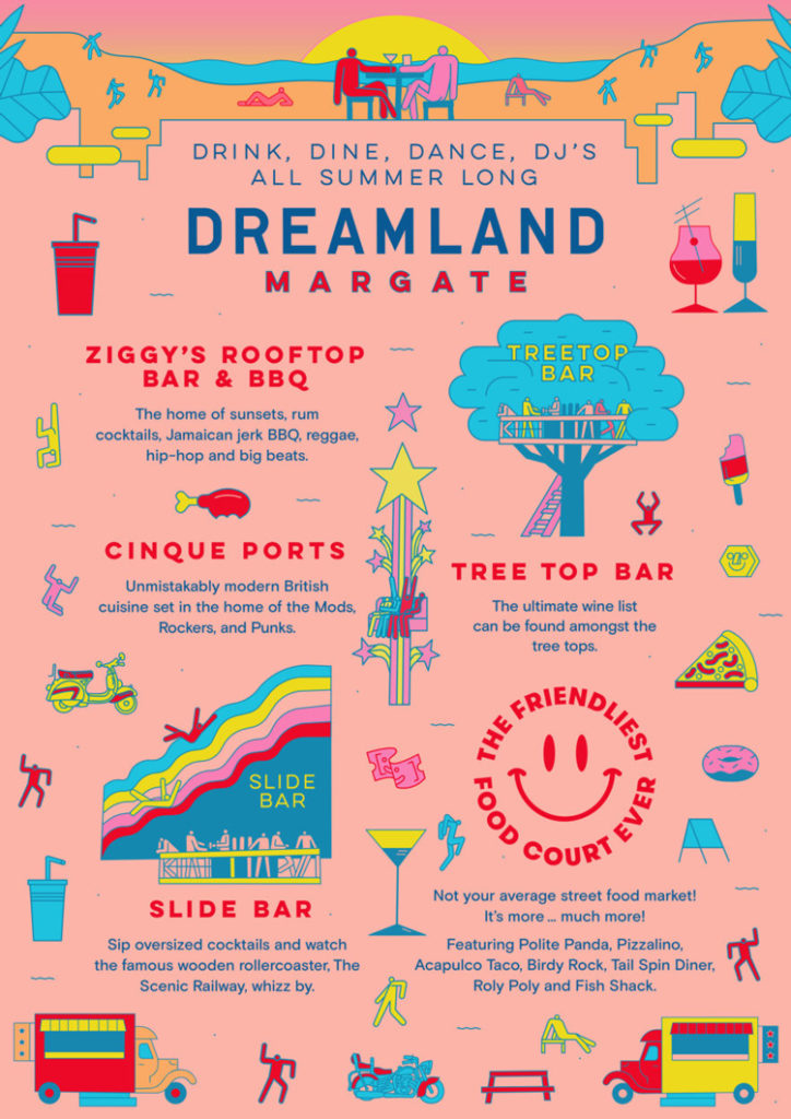
Studio Moross has designed a new 2017 summer campaign for Dreamland Margate, which looks to use illustration and bright colours to set itself apart from other theme parks.
Dreamland Margate is an amusement park based in coastal town Margate in the South East of England, Kent, which originally opened in the 1920s.
It closed in 2005, and was brought back to life a decade later with a new design concept and branding by Wayne Hemingway and his studio HemingwayDesign.
It went into administration a year later in 2016, but has since received £25 million in investment to stay open. Studio Moross was appointed in 2017 to design the relaunch campaign for the amusement park.
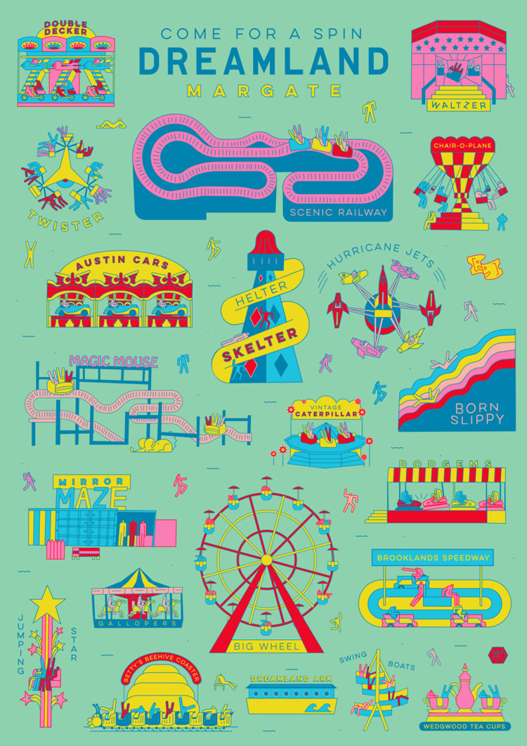
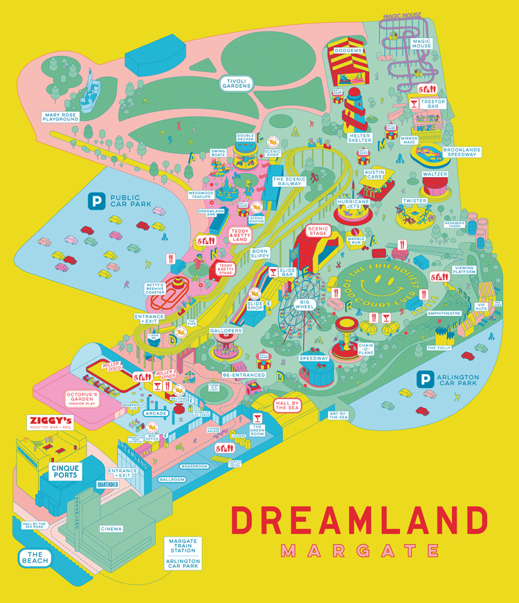
The studio originally designed campaign posters and print advertising for Dreamland Margate, then “worked in reverse”, says art director Kate Moross, to create other visual elements such as on-site wayfinding and maps, and sub-branding for food outlets at the park.
“It’s been a more organic process than just coming in and changing everything,” she says. “It wasn’t a traditional, pyramid redesign – we focused on the things that were most important then filtered backwards.”
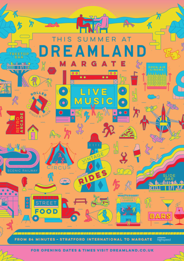
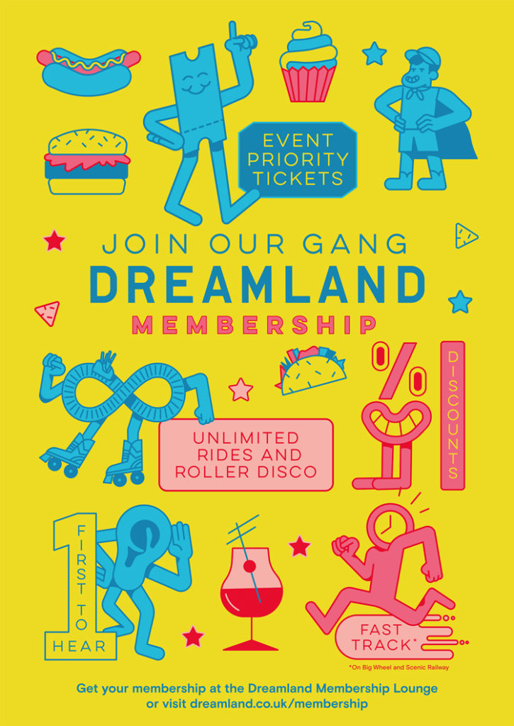
The new campaign materials use sans-serif, “clean” typeface Lulo, a “bright, young” colour palette focused on orange, yellow and pink shades, and illustrations by Mica Warren.
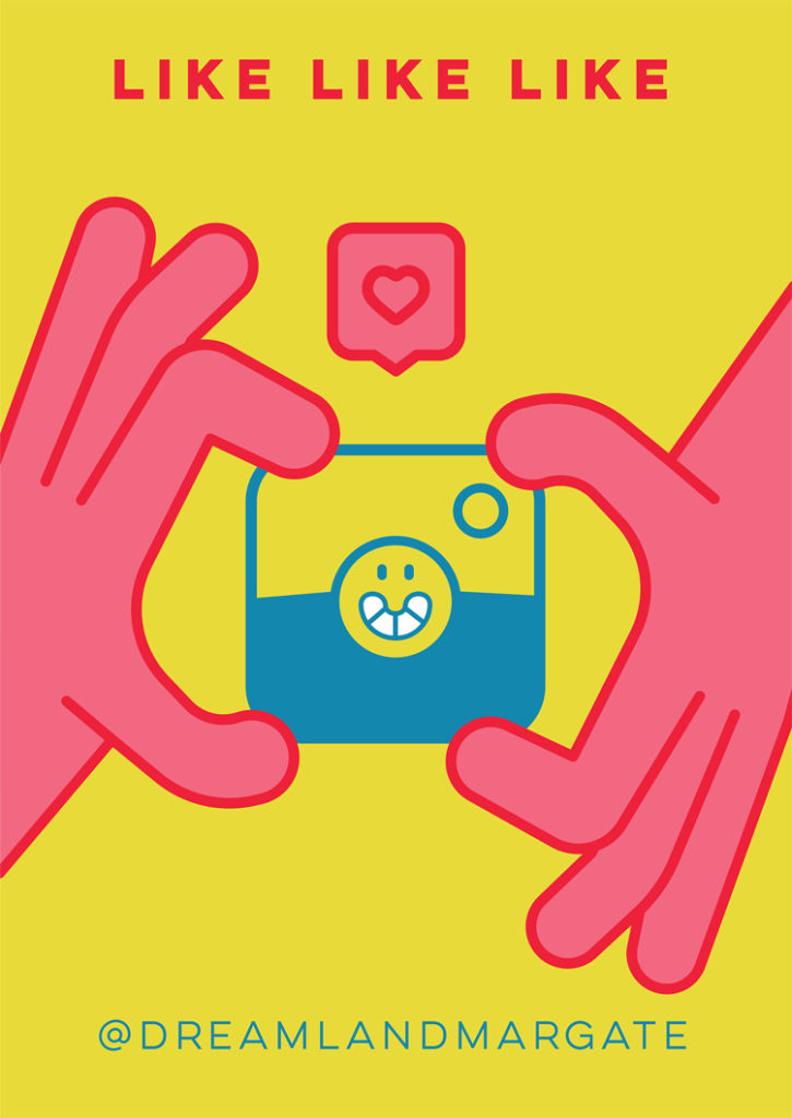
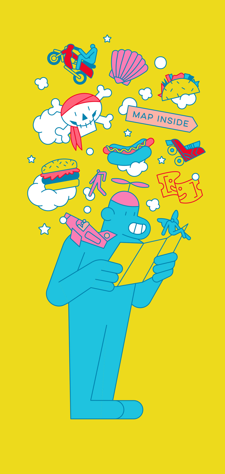
Illustrations depict characters created by Warren, alongside Margate’s offerings, such as rides, food and the seaside.
Moross says that illustration is the “hero” of the new Dreamland brand and aims to help the amusement park stand out from other attractions. The studio will work with a host of illustrators over the next year and a half to create different looks.
“Illustrations have been a key lead on everything,” she says. “They’re bright and colourful, and feel fresh, modern and eye-catching.

“A lot of theme parks use photography in campaigns, so we hope this will set us apart from other similar events,” she adds. “This has worked previously with music festivals we’ve designed for, which have a similar agenda and spirit to Dreamland.”
Moross says the visuals were inspired by HemingwayDesign’s original work and have retained the original logo, but have “brightened everything up a little bit”.
The new look aims to appeal to both young and older people, and attract local Kent residents as well as those travelling from London.
“We try not to get bogged down in demographics,” says Moross. “We just tried to make something that someone will look at and think ‘that’s cool’ – whether they’re five or 45. We wanted to keep it slightly weird and fun, but not patronising.”
The new campaign for Dreamland Margate has launched and rolled out across advertising and print posters across Margate and London. It will continue to roll out on-site and online over 2017 and 2018. The visual look is expected to “evolve and change” every year, says Moross.

