


Kevin Bergquist’s unpredictable illustration style

Kevin Bergquist creates illustrations using a uniquely unpredictable process.
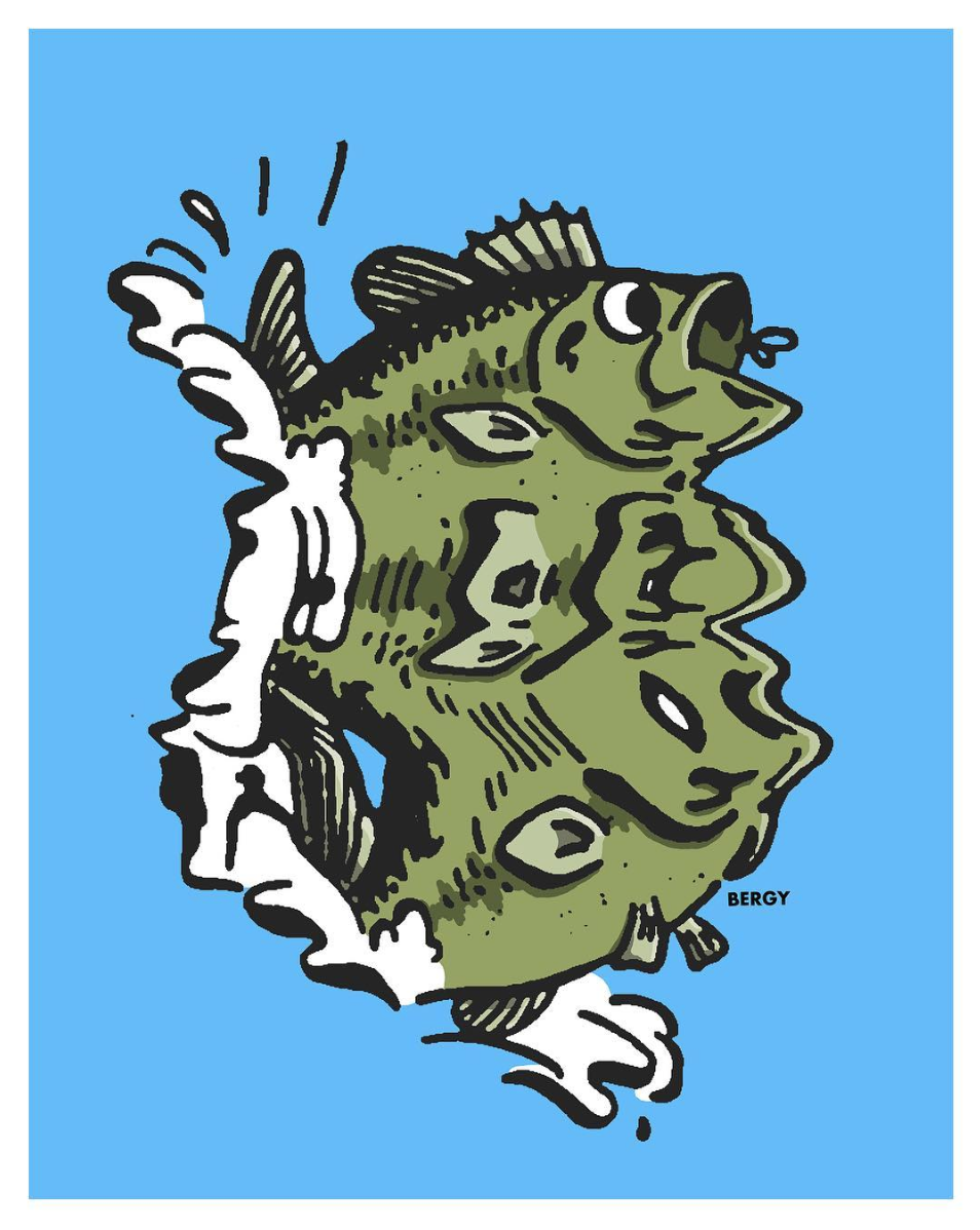
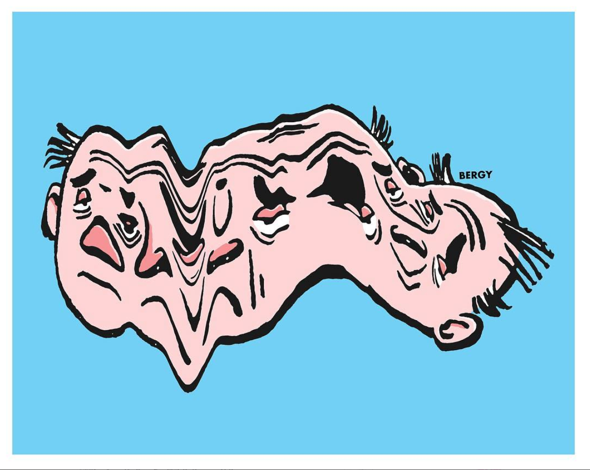
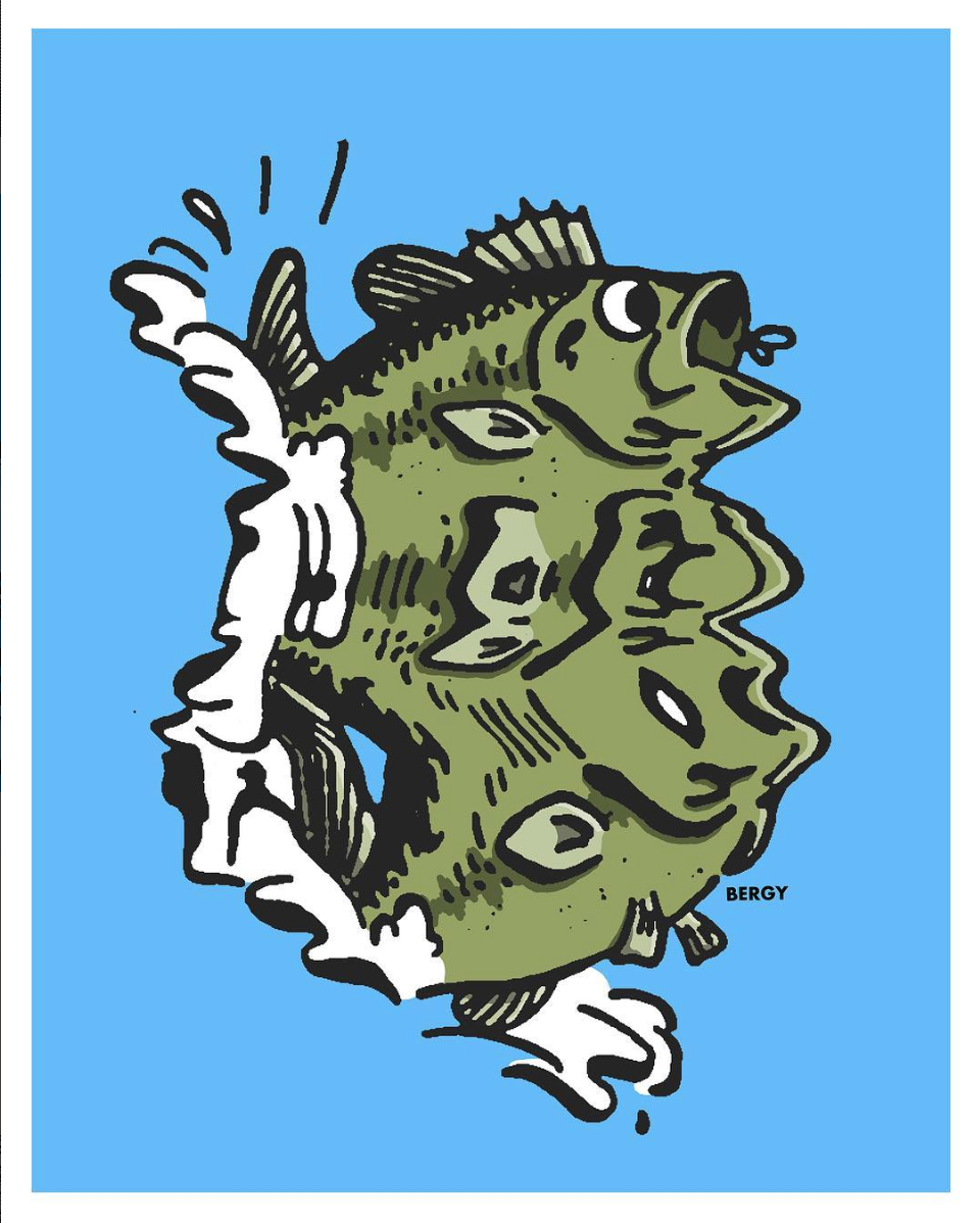
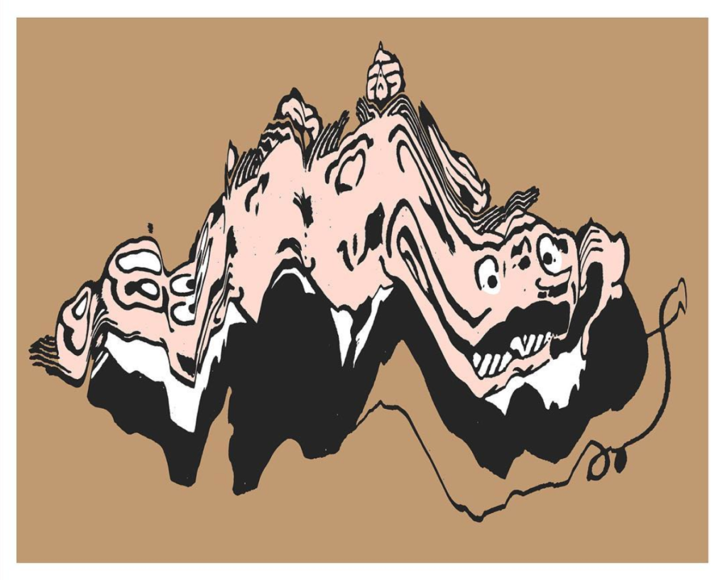
Moving an image as it is being scanned to create a new warped design is a technique most commonly used in graphic design. Artist Kevin Bergquist however has given it an illustrative twist and introduced it as a key part of his creative process.

Less movement is need to make characters recognisable
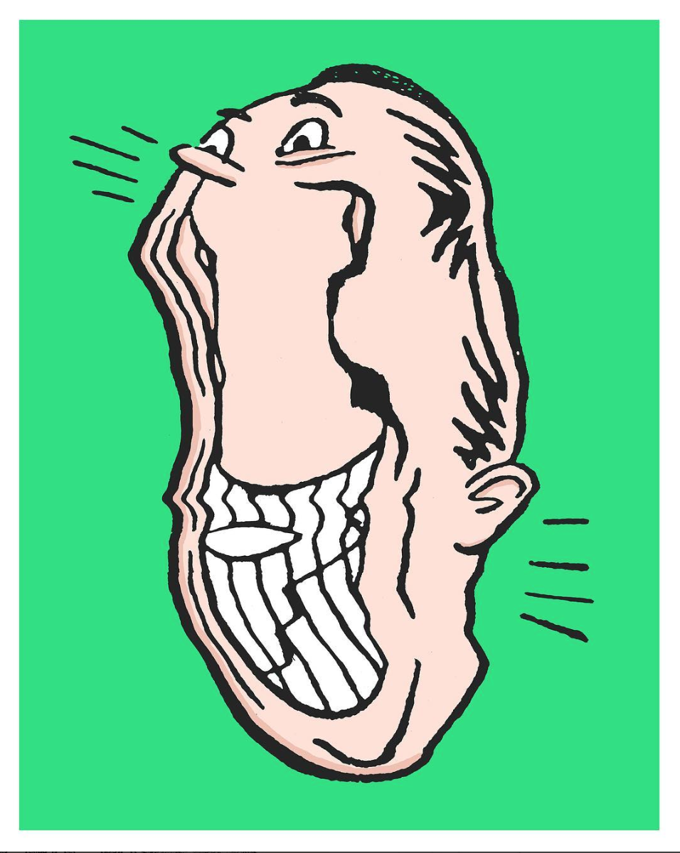
Before being altered as they are scanned, Kevin’s illustrations are first drawn with thick inky black lines. The unpredictable nature of Kevin’s process adds a spontaneity and sense of movement to his work. It can add a sad tone to a long face by lengthening it even further or give the idea of a fish frantically swimming underwater. Anything is possible if you know just how to move the drawing as it scans.

Kevin’s technique gives the idea of movement to his illustrations
Thanks to his unusual process, you never quite know how each of Kevin’s pieces is going to turn out next and the exciting thing is neither does he!
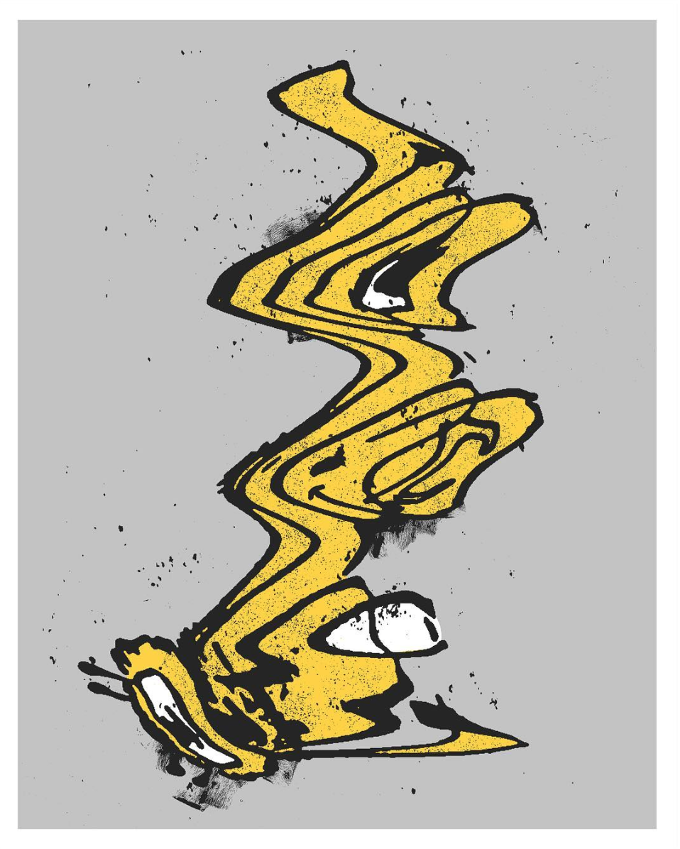
A level of care and attention has to be applied to this process to achieve the desired result. When designing characters, less warp over the facial area is necessary for it not to turn into an unrecognisable mess. Where as, faster movements are need for more textural pieces. Due to this, planning and plenty of patience are just as important as experimentation within Kevin’s process.
Less movement is need to make characters recognisable
Kevin only added colour to his process recently. Previously, he previously worked primarily in black and white creating much more textural work. These bright blocks of colour add a boldness to Kevin’s already graphic work and refine his style even further.

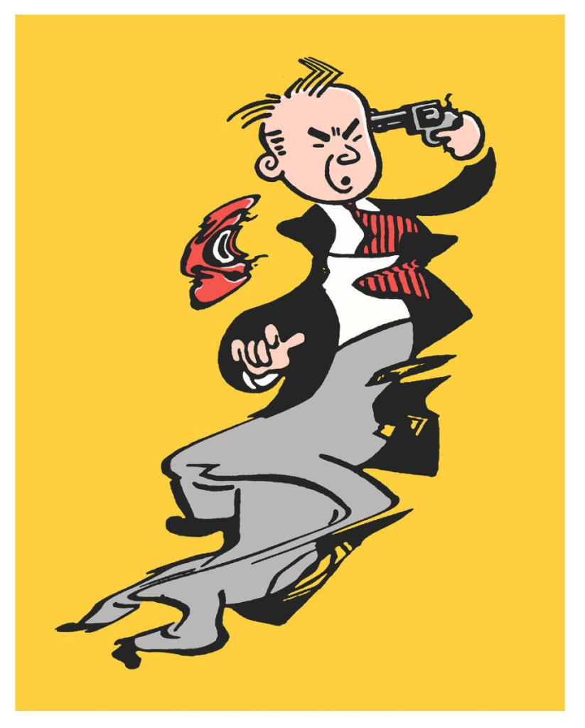
With Kevin’s process, more movement equals more texture
This technique also gives a slightly retro feel to Kevin’s work. The unpredictable shapes and textures which it conjures up are similar to those you find when using analogue printing processes. These more temperamental techniques have come back into fashion recently with designers yearning to add a bit of old fashioned tactility to their work.
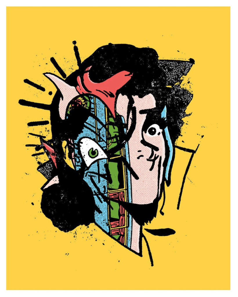
Illustration by Kevin Bergquist

Artwork by Kevin Bergquist
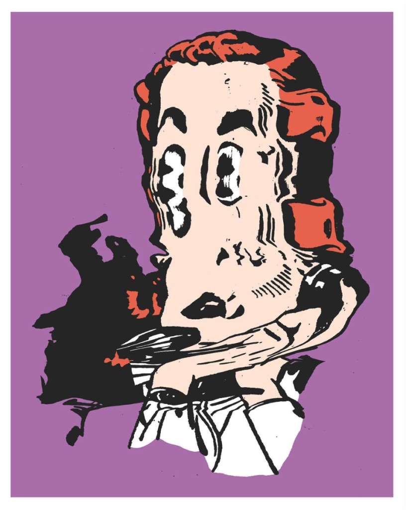
Illustration by Kevin Bergquist
Artwork by Kevin Bergquist