

BÜRO UFHO / Yana & Jun share their tips for designing 3D Type
Yana and JUN are co-founders of BÜRO UFHO, a visual design studio based in Singapore since 2008.
They help develop visual identities for businesses, as well as providing visual solutions for brands. Some of their clients include Adobe, Apple, Facebook, Coca-Cola, HP, Heineken, Mastercard and R/GA. They’re also the artist duo behind kittozutto, creating artworks for Esquire, Nike, HBO, Bombay Sapphire, Sony BMG.
 Who/what at are your main design influences?
We are very interested in typography and design as much as illustration and art, so we are influenced by things that needed both design and illustration. We’ve always admired studios that are not limited by approach and provide a variety of fun and elegant solutions for diverse clients. In our formative years, we were inspired by design studios like Studio Output, Zip Design, MadeThought, ilovedust, Vault49, etc. We pretty much got stuck with the idea that a design studio is style agnostic. Music album covers are a big part, so visual imagery works from Debut Art, BIG Active, Hipgnosis have a huge impact on us. Our time at ad agency Ogilvy as Art Director and Designer also reinforces this idea of finding the right approach that best fits the idea, the project, and the client.
We pretty much got stuck with the idea that a design studio is style agnostic.
 Can you tell us about your visual style? Where do you get your ideas and inspiration from?
We started from photomontages, illustrations, photo-manipulations, to typographic-focused visual identities for brands, to 3D imagery and motion, and now trying to incorporate them all together whenever possible.
Our visual style has evolved over the years. We started from photomontages, illustrations, photo-manipulations, to typographic-focused visual identities for brands, to 3D imagery and motion, and now trying to incorporate them all together whenever possible. So our sources for ideas and inspirations are thus as wide and varied: From the latest developments in digital art software and hardware that can help us create works in new ways; to surreal artists whose works influence us emotionally in the way we seek to express and feel art; to the way how pop artists remixes and find relevance; to lettering artists who pushes how we express with type; to illustrators creating fascinating imaginary worlds with colors; to 3D and motion pieces pushing technological advancement resulting in delightful animations. Instagram, Behance, and Pinterest have been both wonderful and inescapable platforms that probably influenced us more than we’d like to admit.
 What tools or techniques can you share about the process of designing 3D typography? Can you tell us about the software / apps you use in design?
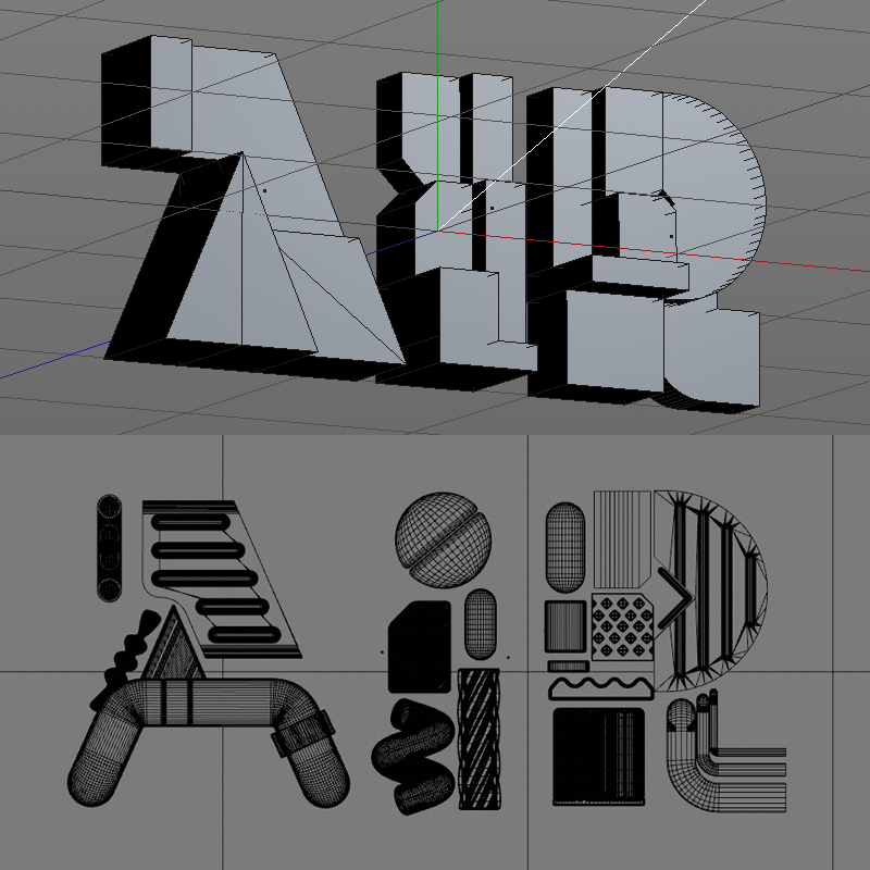
We use an isometric grid sometimes to figure out the depth information while working out a rough composition of the image. They are modeled in Cinema4D and we use Octane as our renderer so we can quickly preview using the live viewer. Adding an Octane camera allows us to adjust settings such as Exposure and Gamma, which can easily help tweak the brightness and contrast of the image.
Can you describe the key qualities required for effective designed vector type graphics? What are the most important considerations for type design? i.e. simplicity, making it recognizable/ legibility, composition, form and shape, etc.
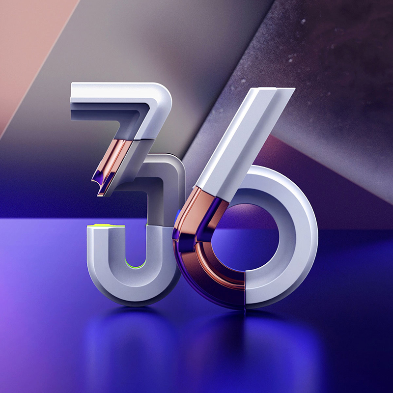
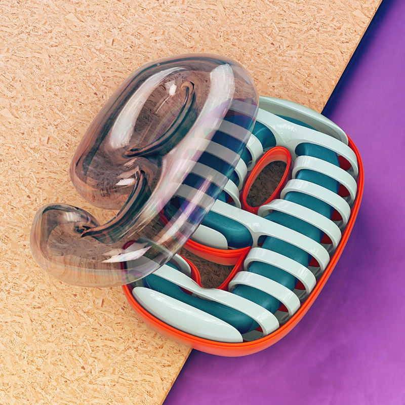
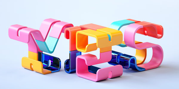
For display type or typographic images, we are constantly thinking of new ways to showcase beautiful letterforms, yet legible enough when placed in a composition suitable for the mood and tone.
For display type or typographic images, we are constantly thinking of new ways to showcase beautiful letterforms, yet legible enough when placed in a composition suitable for the mood and tone. Headlines are for grabbing attention so we try to make them delightful to be remembered. For body copy legibility and tone is our main priority.
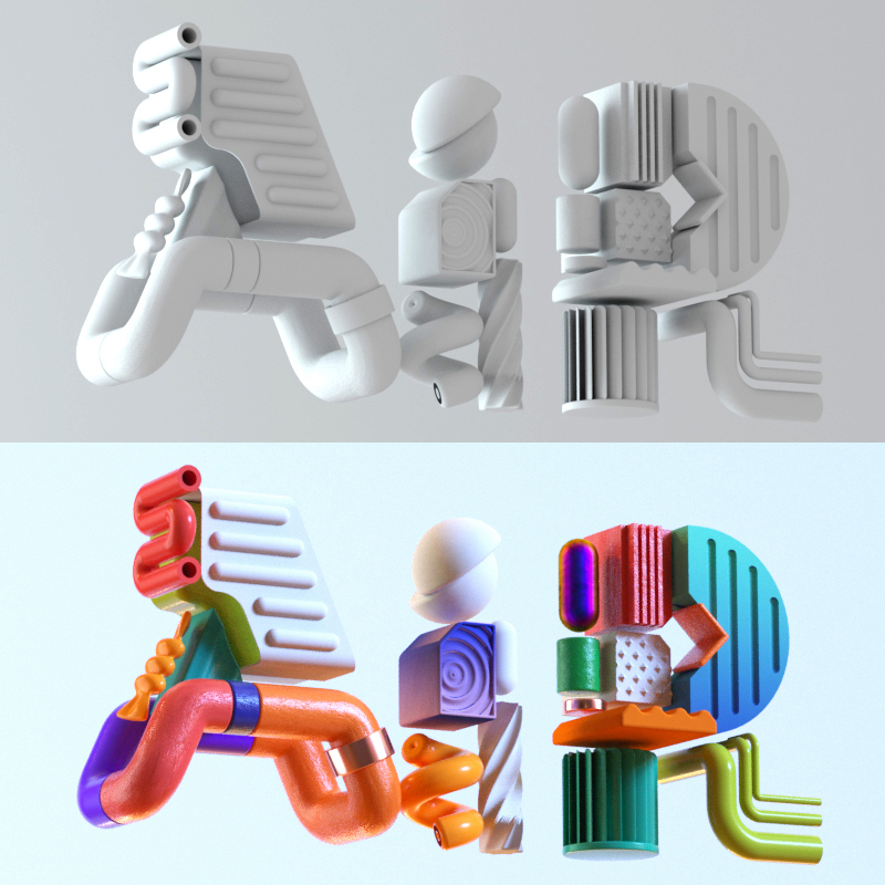
With reference to a recent project, can you briefly talk us through, step by step, one of your well honed techniques for creating a piece of digital type? Please share work in progress / development images.
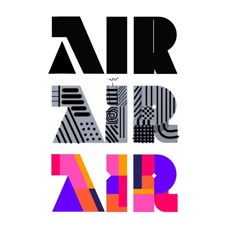 1. Form
Our approach to 3D type is to start by creating a rough sketch of the idea, working out the overall form of the letters. We’d usually go through a list of suitable typeface selections to find something that could be used as a reference point, potential typefaces that could help set the mood and tone for the image. We’ll then block them out into shapes, making sure they have enough weight for our 3D elements to fill up later. Each letter is divided into different sections and subsections and sketched out with lines and basic shapes. At this stage, we’ll have a clearer idea and begin drawing them in Illustrator with different color blocks to visually separate each of the elements for reference.
2. Legibility
Next, we’ll import the vector file into Cinema4D, applying a simple extrusion of the letters to create our basic 3D letters, where we’ll decide on how much depth information is needed. A camera is then added where we’ll set its focal length and rotate the viewing angle to set the desired image composition. From here, we’ll go into detail for each letter, replacing the basic shapes with more detailed elements to fill up each section. Spheres, cylinders, capsules, helix are used as replacements to soften the letters. Legibility is taken into consideration as we tweak the letterforms: Letter A and R are now more legible as we open up their counters. Even though they are supposed to be all uppercase letters, a spherical element is used for letter I to help make it more readable through association with its lower case.
3. Contrast
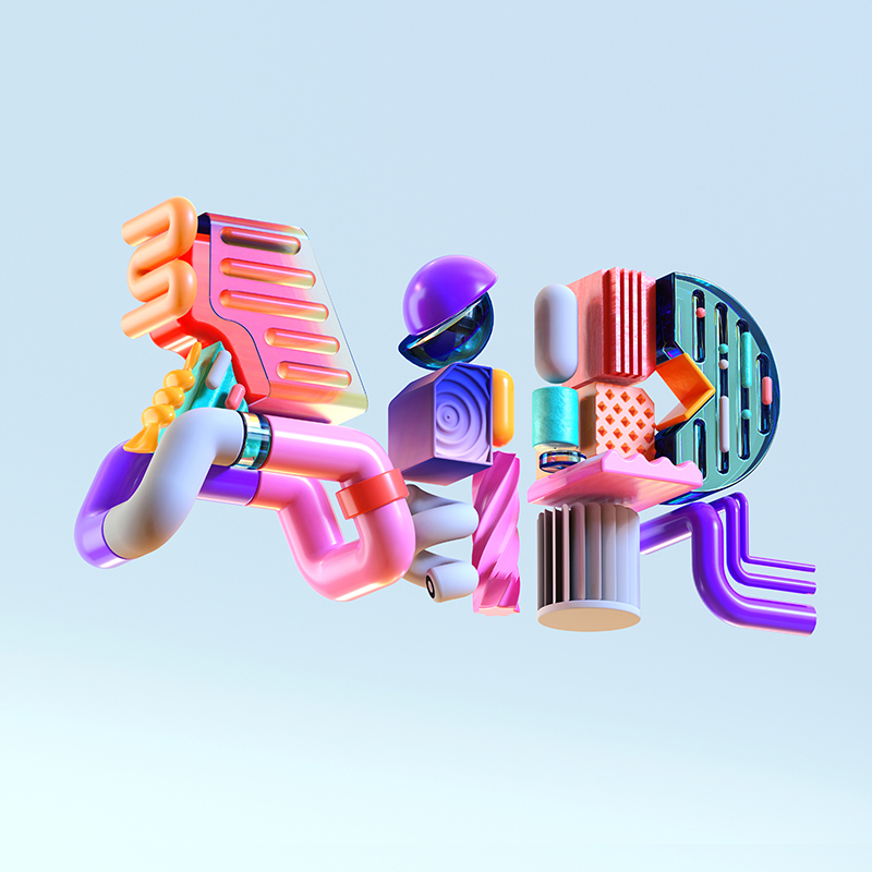
Modeling is done and we’ll proceed with some initial lighting tests by adding environment and area lights to focus on areas we want to showcase. Time to explore ideas on materials and texturing. We’ll apply a variation of shiny glossy material selectively to reflect light as a way of adding detail to the image, filling the rest with a rough diffuse material for contrast. Bevels and bumps are added to create imperfect surfaces for added realism. Gradients are used to break the monotony of solid colors. Metallic and translucent materials are used selectively for contrast to add variation and complexity to the image.
 4. Harmony
What follows would usually be more adjustments, refinements, and adding of details, such as the little spheres and capsules on letter R. Colors are arranged in a way they should contrast against each other but also harmonize. Each letter has a dark area in purple and light areas in grey, so the rest of the colors should support these choices. The background is muted so that these colors stand out as much as possible.
How do you approach colour as a tool for creating work? At what point in your creative process do you start thinking about your colour palettes?
Colors help bring an emotional element to our work. Sometimes working on commercial projects you’ll know certain brand colors are already set before the brief.
Colors help bring an emotional element to our work. Sometimes working on commercial projects you’ll know certain brand colors are already set before the brief. Sometimes mood boards will set a certain tone for the project. Other times we only deal with colors at the later stage when everything’s been modeled, with specific materials applied to certain parts of the image, like a glossy or transparent or metallic material, and then colors will be chosen based on how to best showcase theses choices.
 How do you create atmosphere in your work?
Most of the time it’s about having enough contrast. We’ll first decide on a tone to guide us along the general direction: Is it going to be bright and fun, or dark and sexy? If the letters are going to be colorful, a muted background will make the letters pop out. If it’s going to be a dark background, the secondary colors need to complement or contrast against it for legibility. The same goes for lighting: Less light will result in more shadows for contrast. More lights will result in fewer shadows, bringing out the colors more.
 For creatives who are interested in playing with 3D type for the first time, can you offer a trick, a tip or piece of advice to get started?
Selecting a nice typeface (or using it as a reference) and getting it to look great in 2D is half the work done. A well-lit subject with materials applied to showcase the letterforms can bring it to the next level. To do so, it helps to have a GPU-based render engine like Cycles, Octane or Redshift that will allow us to live-preview what we are doing. It’s worthwhile to invest in a PC with powerful Graphics cards like GTX1080TI or RTX2080. Sites like greyscalegorilla.com and eyedesyn.com have tons of useful resources and tutorials to help anyone get started.