


Multi-disciplinary, award winning visual designer Sonya Dyakova | OFFSET Dublin
Atelier Dyakova is a multi-disciplinary, award winning visual communication agency in London. Founder, Sonya Dyakova, is an art director and graphic designer, who studied and began her career in San Francisco.
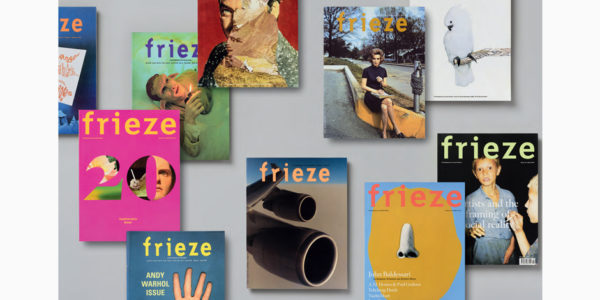
Sonya worked with Vince Frost and Kerr|Noble, before joining Phaidon Press in 2005. While there she worked closely with the iconic British designer Alan Fletcher. At Phaidon she was responsible for the design of a wide range of books, from contemporary art and design to architecture and photography. Her approach is strongly rooted in conceptual and typographic experimentation, developed through research with special attention to tactile details. In 2011 Sonya re-designed frieze magazine and was the publication’s art director for 5 years. She created Frieze Masters and Guestbook magazines. In 2011 she received a Grand Prix from the Tokyo Type Directors Club. In 2013 she became a member of AGI, Alliance Graphique Internationale.
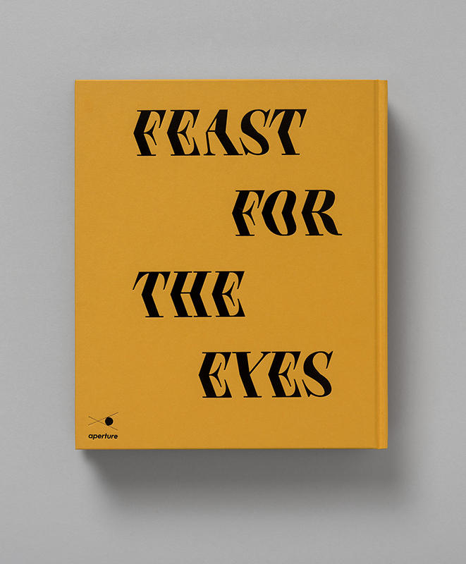
Feast For the Eyes, Aperture, 2017
What are you currently working on?
We’ve recently finished a publication for Jenny Saville whose exhibition is opening soon at the Scottish National Gallery. It’s currently being bound and we shall see it next week.
The Noma Guide to Fermentation, by René Redzepi and David Zilber is nearly complete, though there is still some work to be done.
We are in the concept stages of a book about Mary Ellen Mark’s work also. A fascinating project with a real insight in to her life. Next week we plan to meet with Renzo Piano to discuss an exhibition about identity and graphics. We are also working on a book of family recipes by Anja Dunk, whose German roots have influenced her cooking.
In addition, we’re working with photographers Keirnan Monaghan and Theo Vamvounakis on a cookbook published by Rizzoli called ‘Waste Not’. A book with recipes that get the most from your food. Currently I am also a consultant art director for Hauser & Wirth.
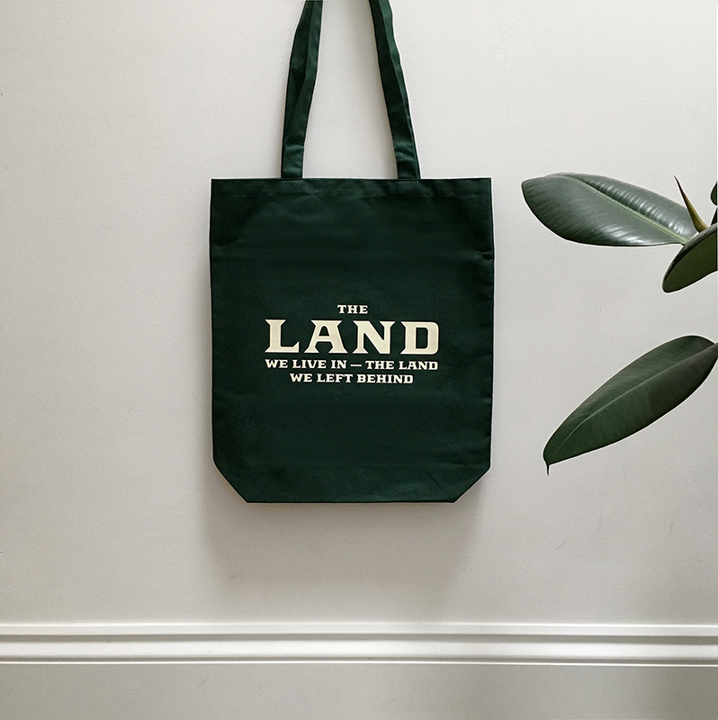
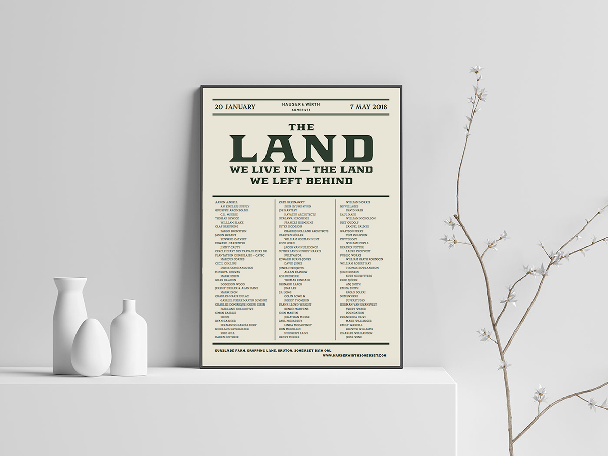
The Land We Live In – The Land We Left Behind, exhibition identity and graphics, Hauser & Wirth, 2018
Prior to establishing Atelier Dyakova you worked at Phaidon Press and Frieze Magazine. What drove you to establish your own agency? What were the biggest challenges during the early days?
Working at Phaidon Press was an invaluable experience. I learned about the process of book making, from initial ideas to production.
The desire to set up on my own was to be in control of my own destiny in every sense. From being responsible for how I spend my time to how much I earn.
The desire to set up on my own was to be in control of my own destiny in every sense, from being responsible for how I spend my time to how much I earn. Being exposed to different kinds of projects and meeting people from various backgrounds was another major factor.
Since I have set up the atelier, the range of projects has really widened. The subject matter is ever changing, so I’m grateful for clients having trust in my abilities beyond the obvious. We have been working on brand and exhibition identities, packaging and magazines, even though book design is the foundation of my practice.
I knew that I wanted to set up a studio before I started working with Frieze magazine. But I also wanted to make it a gradual process. I re-designed frieze magazine while working 4 days a week and eventually it became a part time project once the re-design took roots.
At the start, when I found a little desk space in Scrutton Street, I contacted a lot of people letting them know about what I do. For a while it was quiet, but then, like an avalanche the projects started pouring in. I felt like at first I was chasing the wave, and then suddenly I was running away from it, trying not to be swallowed up.

The Land We Live In – The Land We Left Behind, exhibition identity and graphics, Hauser & Wirth, 2018
You recently created the graphic identity for ‘The Land We Live In, The Land we Left Behind’ for Hauser & Wirth, Somerset. How did you embark upon reconciling the “blue-chip” identity, associated with gallery, and the exhibitions seemingly opposing rural, earthy line of inquiry? Can you talk us through the creative process for tackling this brief, from initiation to delivery?
Iwan and Manuela live on a farm in Somerset, not too far from the gallery, and since I got to know them I see how much genuine joy they get from being in the countryside.
Hauser & Wirth Somerset is truly a unique setting and the reason that it is so successful is that it’s a labour of love. The exhibition explores our relationship with the rural, and to me it is very fitting to the gallery who are based in London, New York, LA, Zurich… and Somerset.
The Land exhibition ‘landed’ on my desk and I realised it was a gem of an opportunity to create something special. The gallery director sent an image of a local cattle auction poster as a visual reference. I really fell in love with this direction.
The beginning stages were about finding a medley of typefaces that could work together in an eclectic and wonderful way.

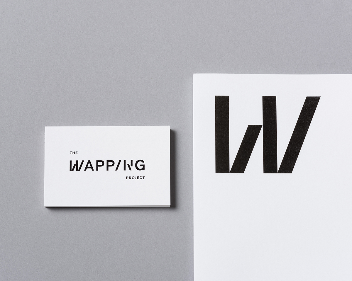
The Wapping Project, identity, 2018
The identity then emerged. At first as a poster that featured a list of about 100 artists and creatives working from the 1500’s to the present day, and from this point we developed the collateral material, exhibition signage, digital tools, etc, each time trying to use a slightly different variation of type, but keeping the overall identity consistent.

The Wapping Project, identity, 2018
You state that your approach is “rooted in conceptual and typographic experimentation” and “attention to tactile details”. How do you “play” and explore these elements (analogue vs digital)?
It mostly comes from fear of boredom. I try my best to find something unusual with each project, no matter how small a detail, to keep my brain ‘entertained’ or challenged.
When we are thinking about ideas, we are looking for something that you can say in a sentence, and without even seeing anything visual you would have your reasoning laid out.
Typography is a major element that I enjoy using, at times we create bespoke lettering (Guillermo Kuitca book) or modify existing one by adding glyphs (Wapping Project)
For example, Jenny Saville’s bodies are curvaceous and larger than life. Flesh presses up against the edges of the canvas, as if they won’t fit. We have searched for a typeface that has voluminous O’s, as round and human as can be. And the elements in the layout are pushed to the thin margins.
Or the brief for ‘Waste Not’ cookbook for Rizzoli I mentioned earlier stated that the publisher wanted to make the idea of cooking with scraps glamorous. With that in mind, we made the book look like a fashion magazine.
We look for little stories like that.
Typography is a major element that I enjoy using. At times we create bespoke lettering (Guillermo Kuitca book) or modify existing type by adding glyphs (Wapping Project).
Tactility is something that invariably is an essential factor in all the projects. How does something feel? How is it experienced? Is it folded or bound in an unexpected way that serves the idea?
Research is the most fun part, because it’s about looking, but not yet doing.

You really get the sense that research is important to you and the studio when tackling a brief. For example, within projects such as ‘Feast For the Eyes’. How does the studio carry out its research? Is there a tried and tested approach and methodology?
Research is the most fun part, because it’s about looking, not yet doing. These days so much information is at our finger tips, and while we do spend time looking at relevant references online, it is equally valuable to get out and go see a show perhaps even unrelated to the subject; or go to a book shop, spend some time looking. Just ‘stewing the ideas in their own juices’ until you can’t stand it anymore, and the sketches have to start.

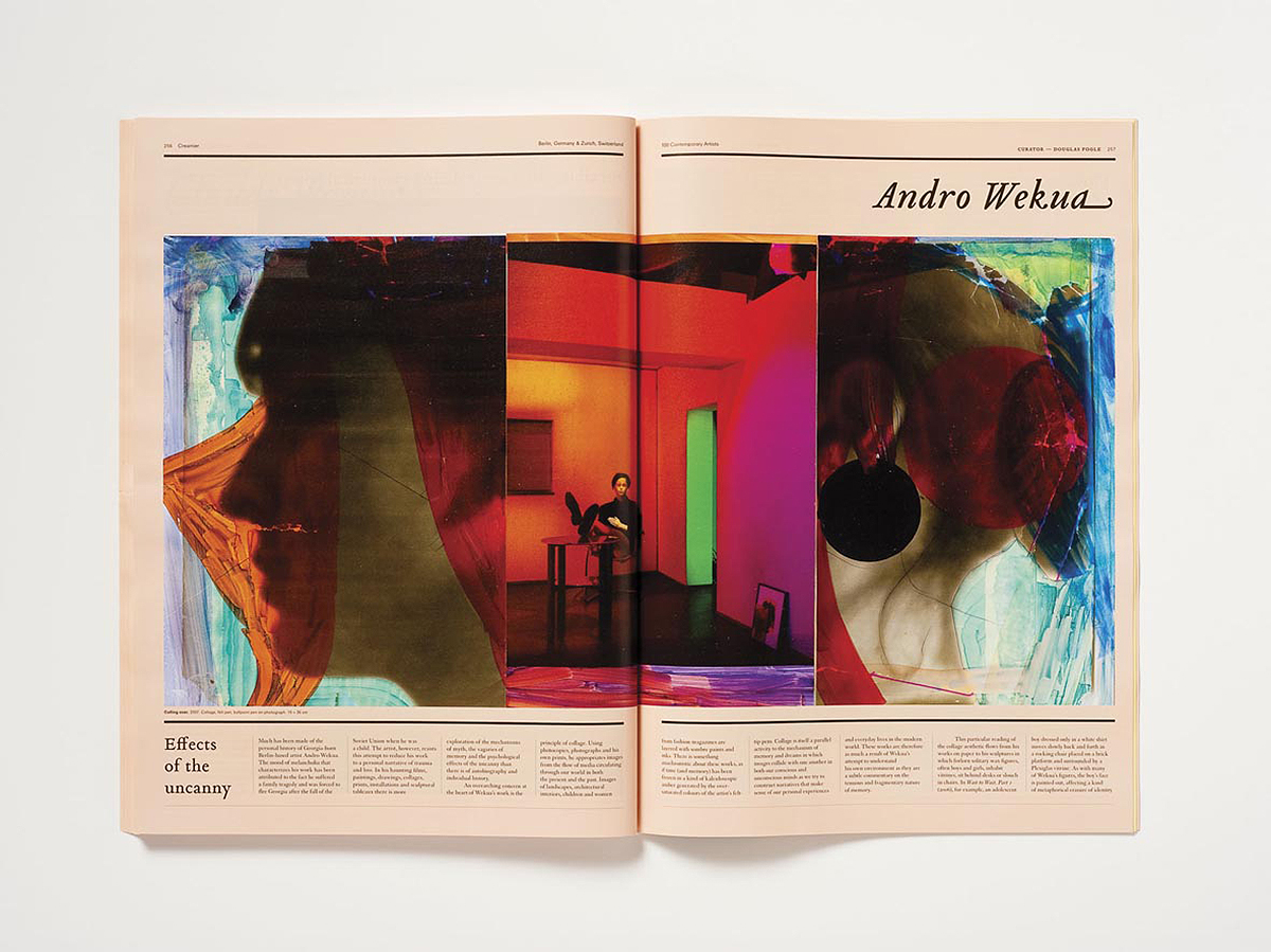
Creamier, Phaidon Press, 2010

Creamier, Phaidon Press, 2010
In your words, what makes Atelier Dyakova unique?
I haven’t got a clue, it’s not for me to say….?
A weird accent?
An ability to catch the essence of the subject matter and strip away all else, gently. Design is always in the background and the content / ideas come first.
I’d like to think I can articulate and explain our thought processes in a way that people understand and appreciate.
What are you most looking forward to about attending and speaking at OFFSET Dublin this year? Have you spoken at similar events before?
I don’t do a lot of public speaking, as I find it quite daunting!
The biggest audience I’ve perhaps had was speaking at HERE, some years back, in 2012. Recently I spoke at Nicer Tuesdays about ‘Feast for the Eyes’, a book on the history of food photography. I’m looking forward to meeting other speakers most, and hearing them speak.
Then, my work, being genuine and happy, and feeling of progress, hopefully travelling to some new places. These are my hopes and goals.

Finally, what do you hope to see for yourself in 2018 and beyond, both personally and professionally?
Most important things — my two children, their well-being and creative and emotional development. Family, I don’t see enough of them since I moved to UK 18 years ago.
Then, my work, being genuine and happy, and a feeling of progress. Hopefully travelling to some new places. These are my hopes and goals.