


In-Focus: Emily Forgot on spatial illustration
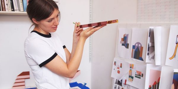
Emily Forgot is the moniker of graphic artist Emily Alston, who applies her playful visual language to illustration, retail display, print design, limited edition prints and ceramics.
We talk to her about taking illustration beyond the printed page.

What does a typical day look like?
I try to have some sort of routine. I’ll usually get to my desk at around 9am, check my emails and drink tea before getting to work on the fun side! Emails and admin are starting to take over a little, so I’m trying to get the balance back.
Where do you find inspiration?
The longer I work in the industry, the more in tune I am with my personal vision. My love of Surrealism definitely makes its way into my designs. A lot of my visual references are stored on my blog, Muse & Maker. I’m not too serious as a person and I like things that make me smile, so I guess it’s inevitable that this playfulness comes through.
You’ve applied your creativity to a variety of media, from large window displays to ceramics, prints and 3D – what do you like to do most?
I like working on windows and spatially. Illustration can feel quite repetitive, with clients often wanting a slightly different version of something you’ve already made. It’s nice to have my feet in a few different areas to keep things interesting. As long you’re not confined to the printed page, the possibilities with illustration are endless.
Working as an illustrator, you’re often responsible for every aspect of what you do and it can be a solitary activity, whereas spatial illustration is more about working as a team. Dealing with the production side of things can get tricky but it’s always so rewarding.

How do you overcome tough days?
Getting away from my computer can really help if I’m not feeling productive – there’s no point sitting there waiting for inspiration to strike! As a freelancer it’s important to manage your time effectively.
I can often achieve twice as much the next day if I give myself a break – taking a trip to the library or visiting an exhibition is always good.
Do you have any tips for gaining commissions?
If you always strive to do the best job you can, people will remember you and want to work with you again. Your output is your best promotional tool. Sending out newsletters every so often featuring new projects is a great way to keep people up to date.
What motivated your transition into children’s products?
My niece was my inspiration. I created a name print for her nursery when she was born and it attracted lots of interest and personal requests for prints, which led to me designing the whole alphabet and launching Nursery Names earlier this year. It’s provided a nice side income to my commercial work.
What piece of practical advice can you offer to aspiring artists?
Stay true to yourself and always make the best work you can.

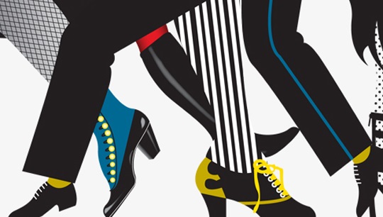
In Focus: Illustrating a hoarding for Selfridges
Selfridges approached me with a brief to create a hoarding to be used while the new shoe department was being created in-store. I had to pitch my ideas as they’d asked several illustrators to work to the brief.
Rather than waiting for inspiration to strike, I like to have a flick through my book collection with a cup of tea and a sketchbook. I collect Graphis Annuals from the 1950s-1980s and often find images in them that act as a springboard to an idea. On this occasion it was Japanese graphic designer Shigeo Fukuda that provided my inspiration, when I stumbled across a famous leg optical illusion that he created.
Taking the idea of simple, repeatable leg motifs I got back to my computer and researched shoes from the ages, from 19th century boots to 1970s platforms and gentleman’s brogues.
I thought it would be nice to add a more whimsical Emily Forgot twist so I added unusual things like horses legs, ballerinas, roller skaters and an octopus!
I’ve got quite good at drawing directly in Adobe Illustrator and often don’t need to trace my original drawing. I just have it up on screen to reference on the art board or in front of me in my sketchbook.
Originally I wanted the illustration to be black and white with patterning to give composition depth, however Selfridges were keen to include high contrast colour so I provided them with some different options. It was great to see the final artwork, Parade, on the hoarding in-store. It’s a great feeling to see something originally drawn in a sketchbook designed on a 3-metre high hoarding!
emilyforgot.co.uk
This interview originally appeared on IdeasTap.