


80’s inspired brand identity for Grilled Cheese Wonderland by BÜRO BÜRO
WE ARE BÜRO BÜRO is an art, illustration and graphic design collective based in Hamburg and Braunschweig (Germany), run by Julian »BITER« Faudt and Stefan »STUKA« Mückner.
Whether they’re working in graphic design, on a branding brief or large scale mural, BÜRO BÜRO produce hi impact visuals for a variety of global clients. Taking inspiration from 80’s and early 90’s skateboard and surf punk graphics, their recent collaboration with Frau Dr. Schneider’s Grilled Cheese Wonderland combines bespoke type with a vibrant colour palette to deliver a playful and attention grabbing brand identity rolled out earlier this year.
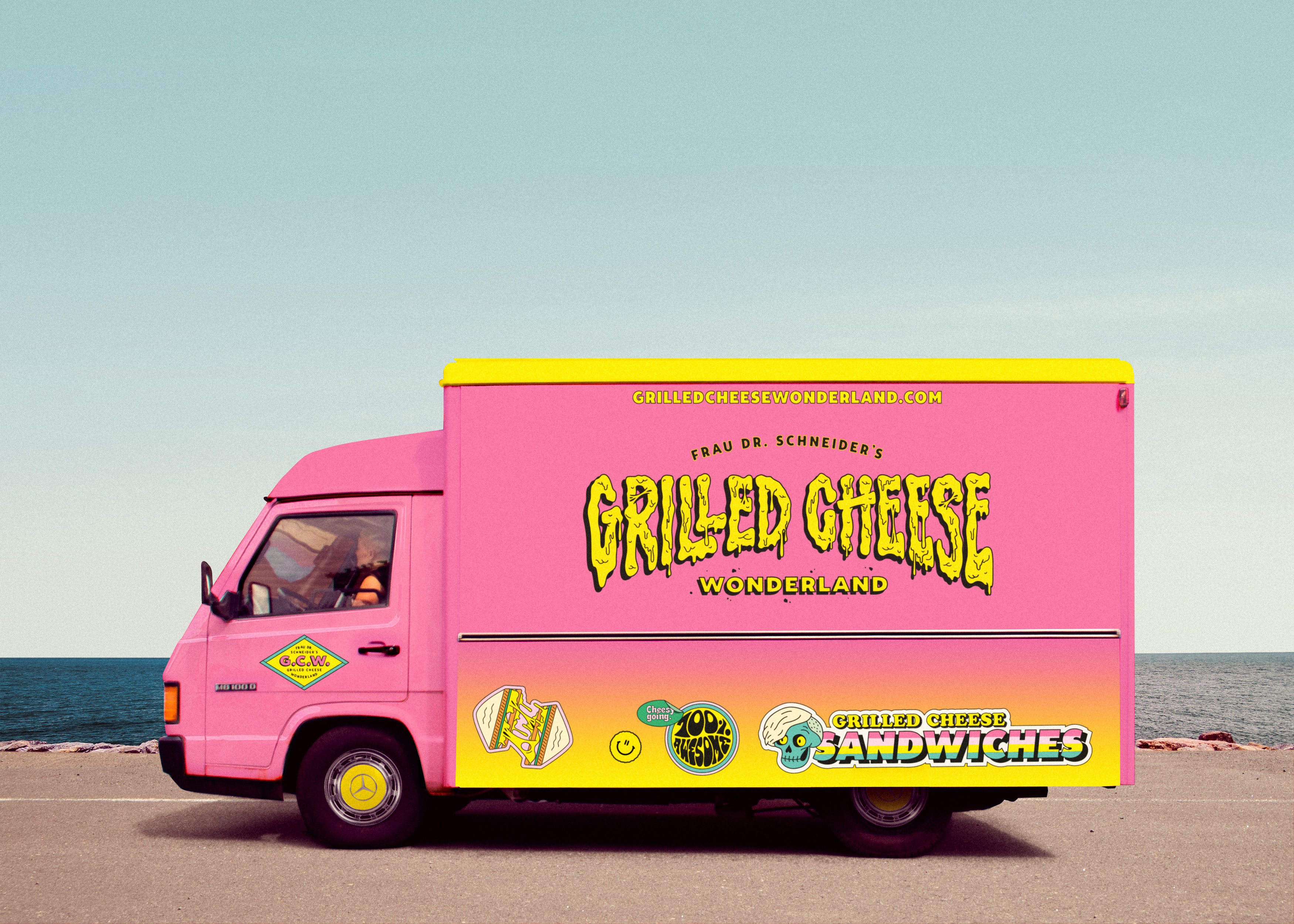
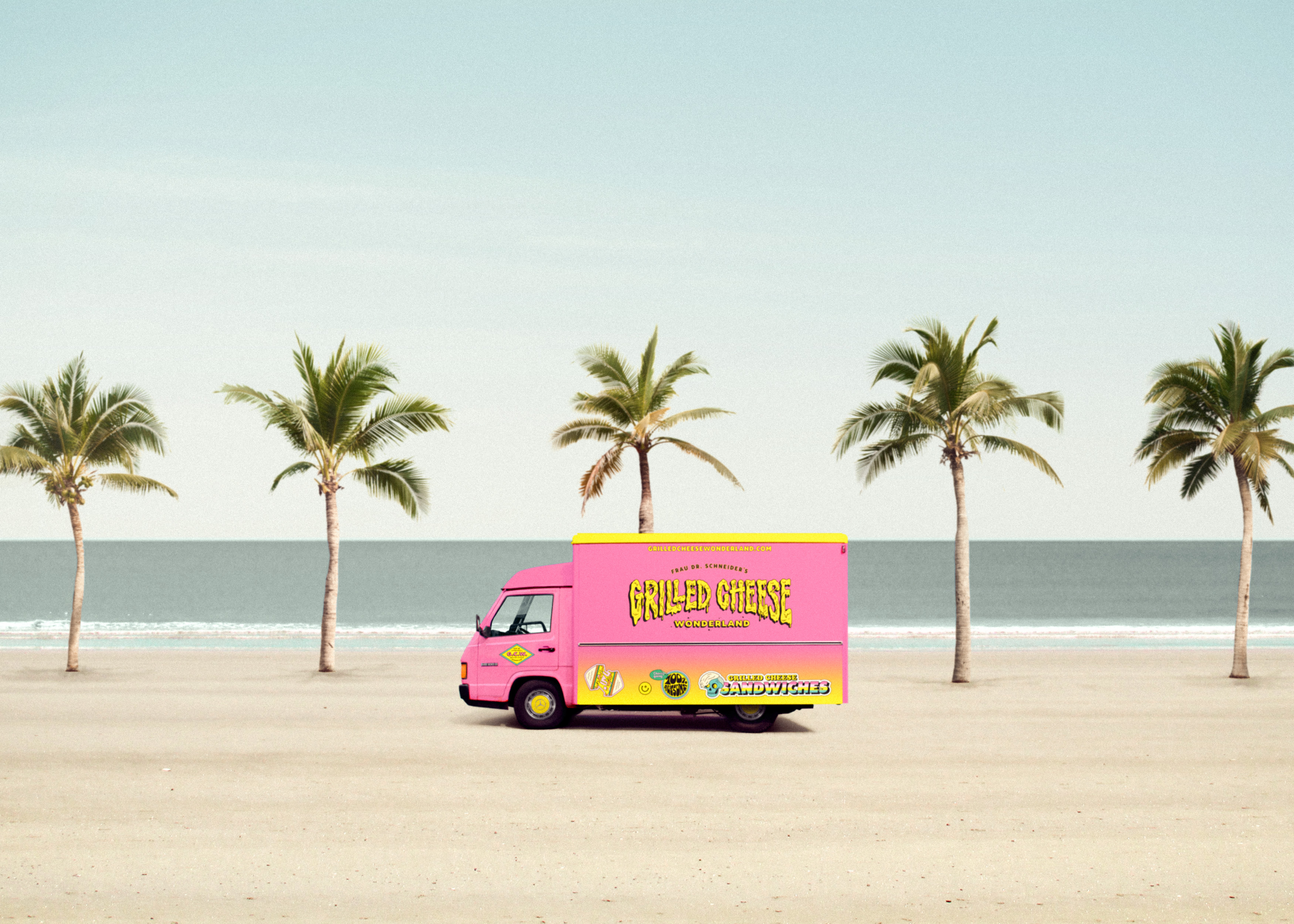
Frau Dr. Schneider’s Grilled Cheese Wonderland Foodtruck
Can you tell us about the brand/client, their initial design brief and what they were looking to achieve with the new identity?
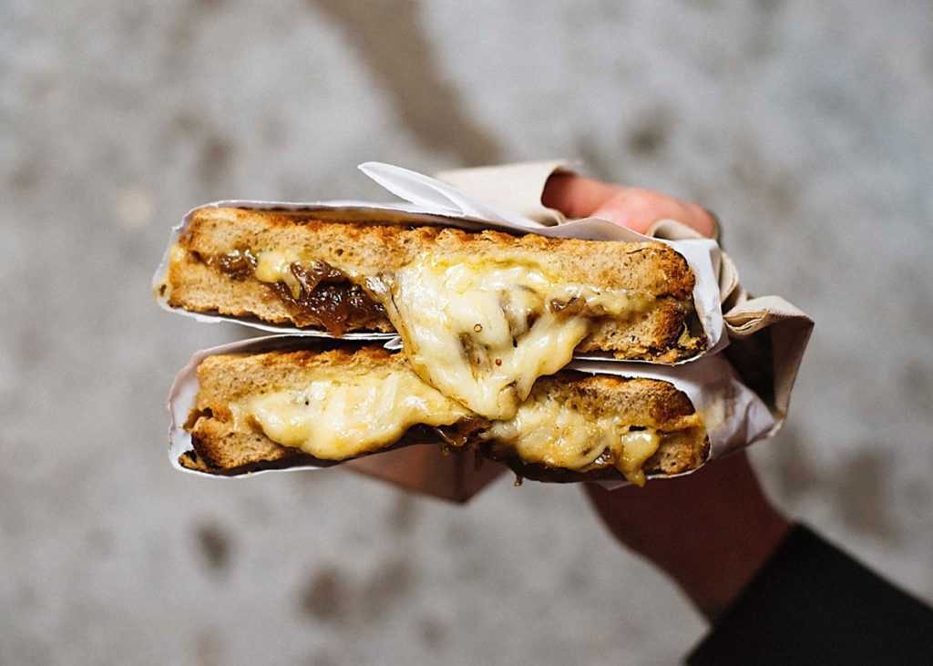
Helena, founder of Grilled Cheese Wonderland, is a trained chef who used to work in different starred restaurants as well at Jamie Oliver cookery school in London, holding cooking courses. At the end of 2015, she decided to become self-employed and founded Frau Dr. Schneider’s Grilled Cheese Wonderland. Starting with a market stall, she took the step after some time to set up a food truck in a converted Mercedes MB 100.
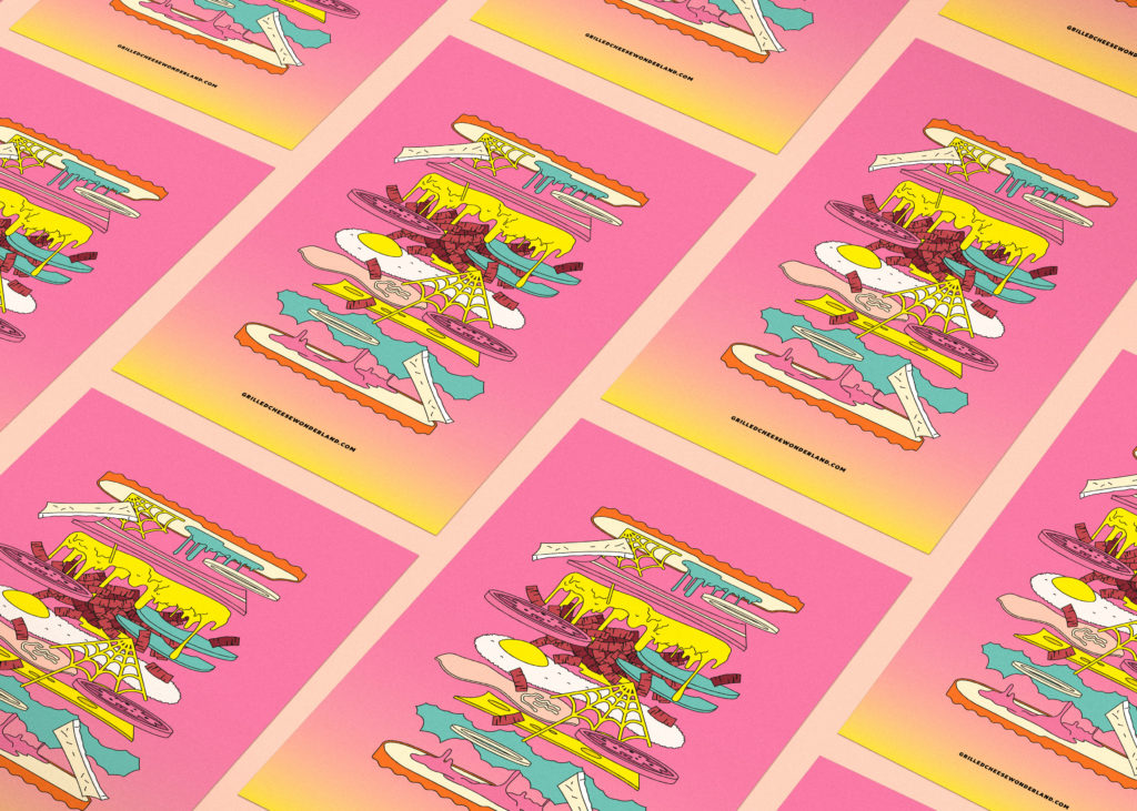
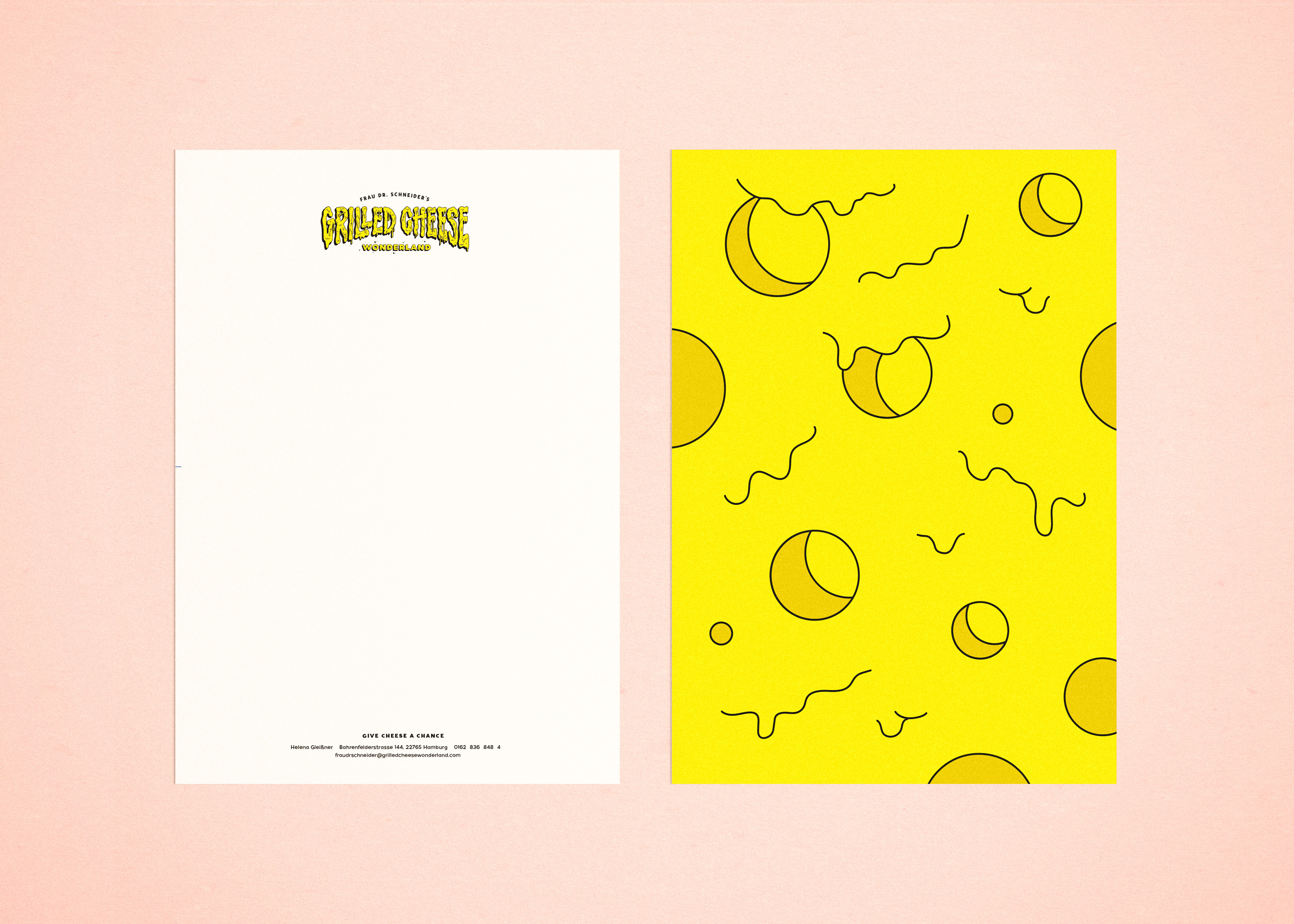
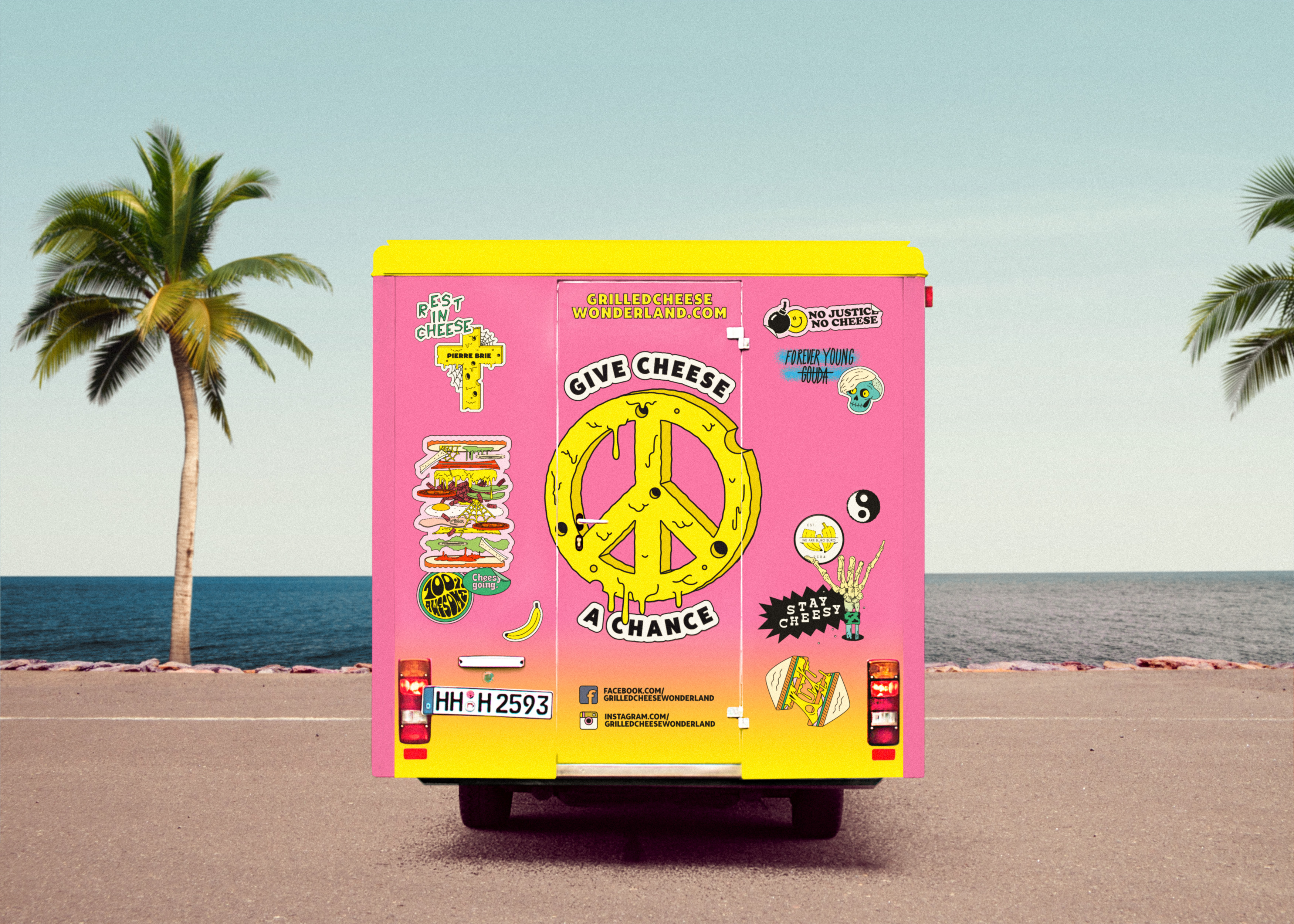
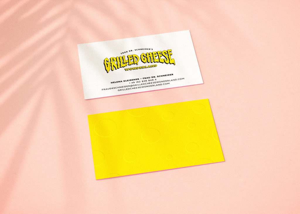
Branding and illustration for Frau Dr. Schneider’s Grilled Cheese Wonderland

Branding and illustration for Frau Dr. Schneider’s Grilled Cheese Wonderland
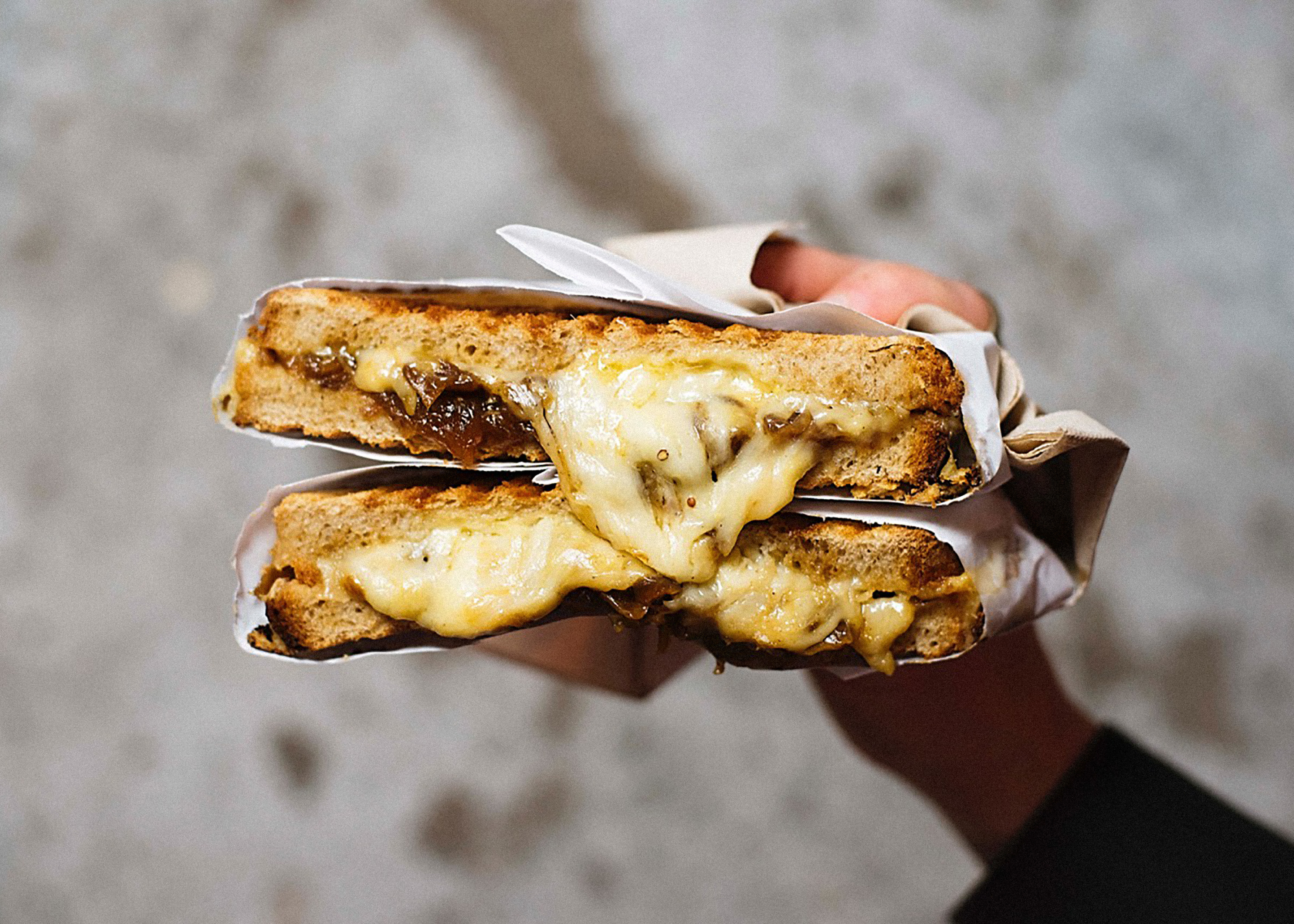
Our aim was to develop a visually strong and unconventional identity, which transports the Grilled Cheese Sandwiches subject in a humorously and funny way.
Branding and illustration for Frau Dr. Schneider’s Grilled Cheese Wonderland

Branding and illustration for Frau Dr. Schneider’s Grilled Cheese Wonderland
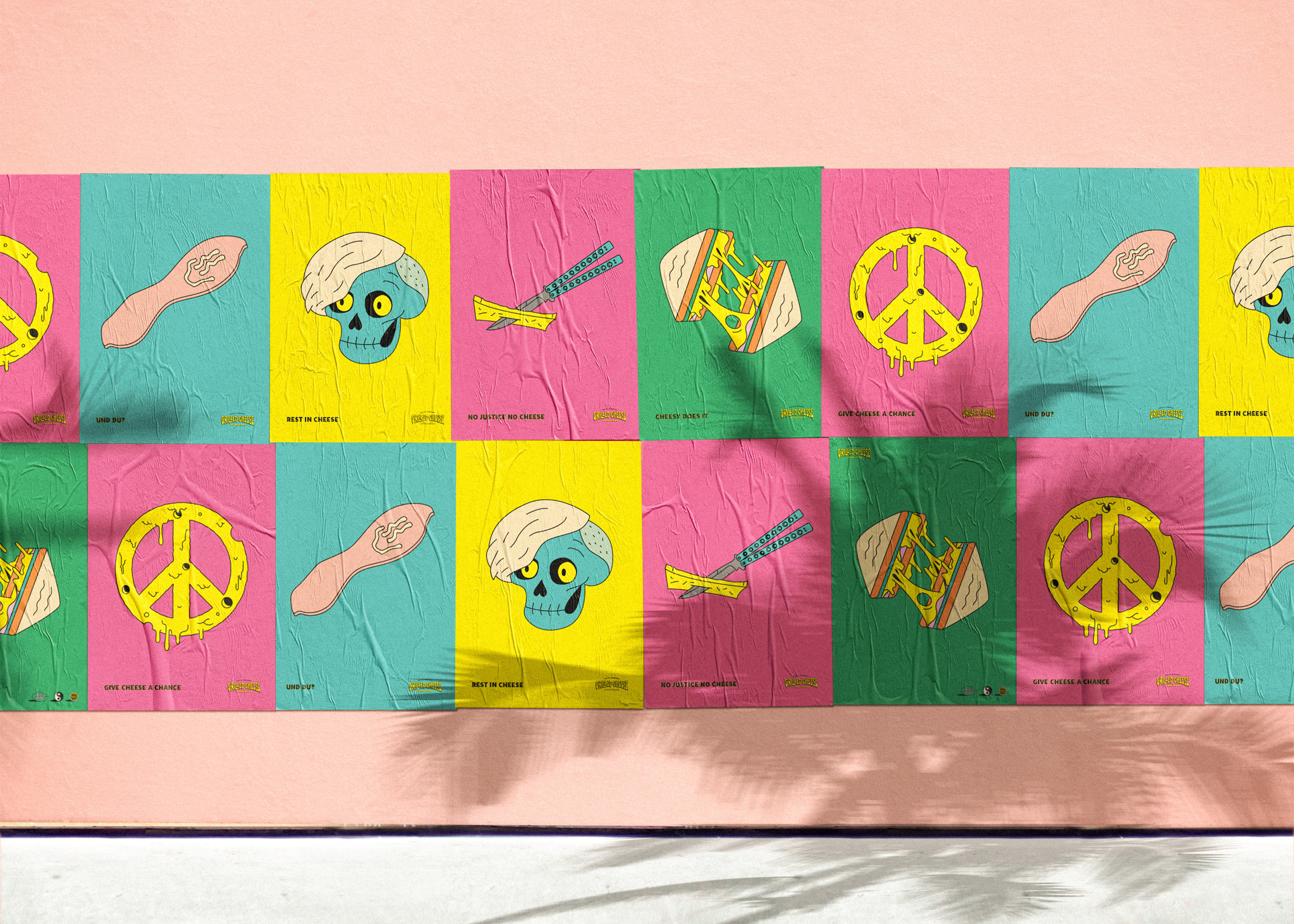
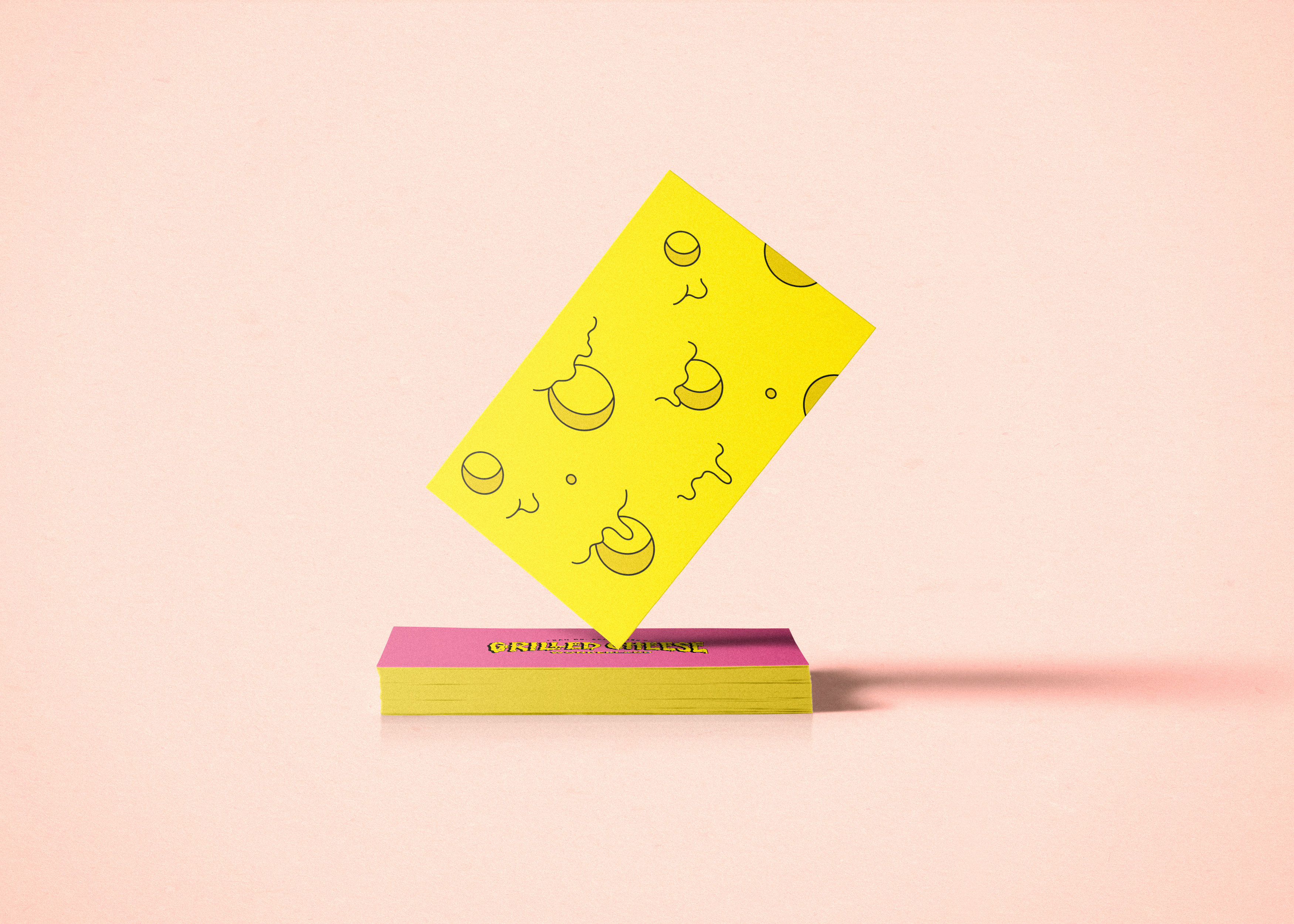
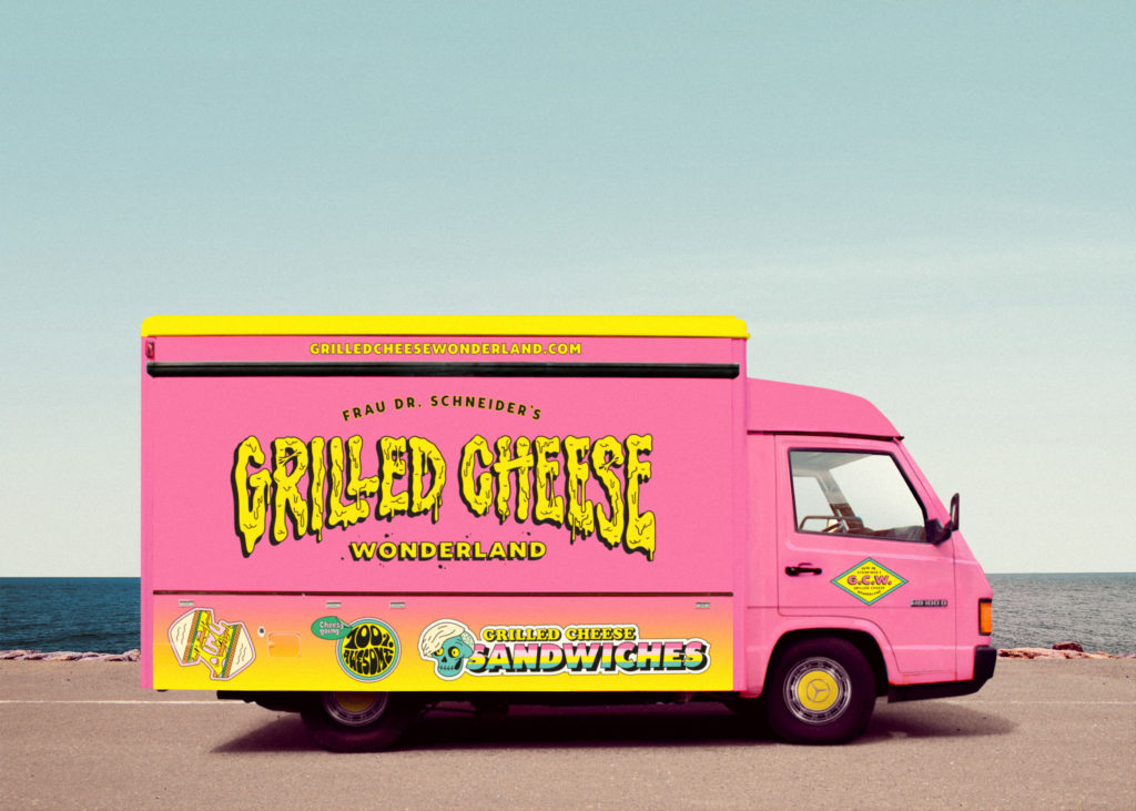
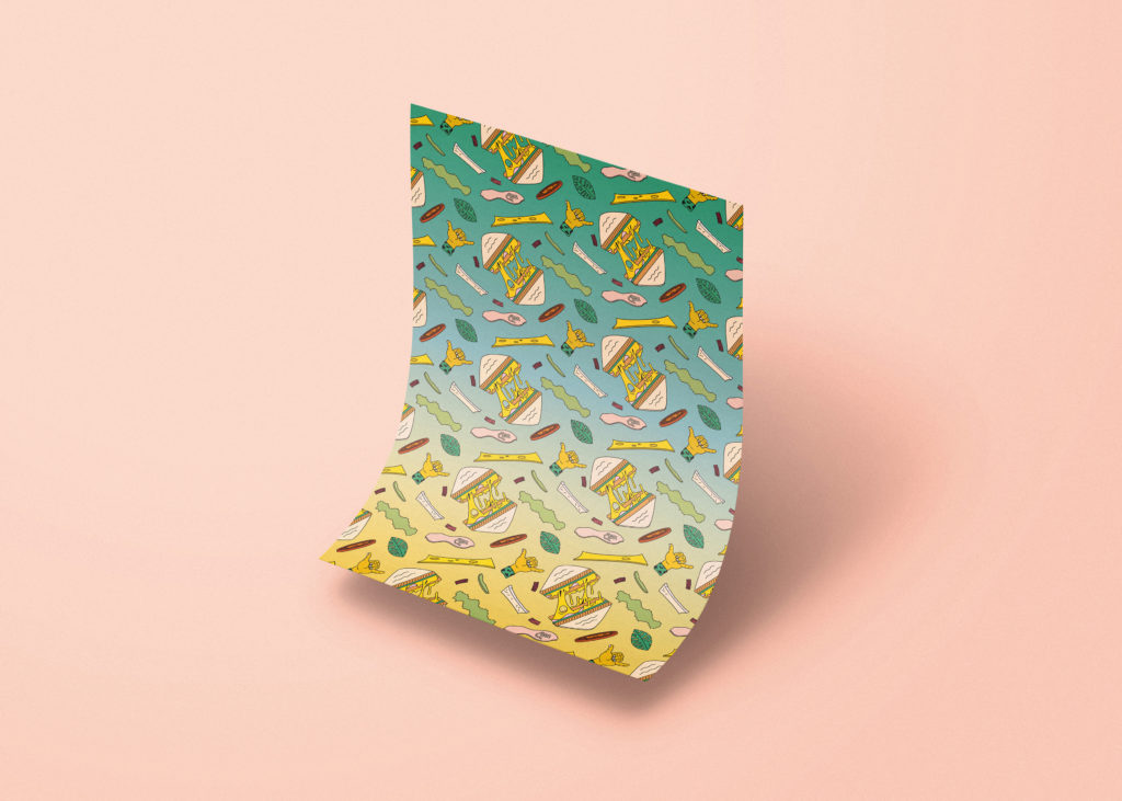
Our aim was to develop a visually strong and unconventional identity, which transports the Grilled Cheese Sandwiches subject in a humorously and funny way. The 80’s surf punk inspired graphics are the core design elements of the identity and shape the overall look and feel; we designed a bespoke dripping logotype inspired by the idea of melting cheese on sandwiches with the wink of an eye. complimenting it with a set of surf punk-like typefaces.
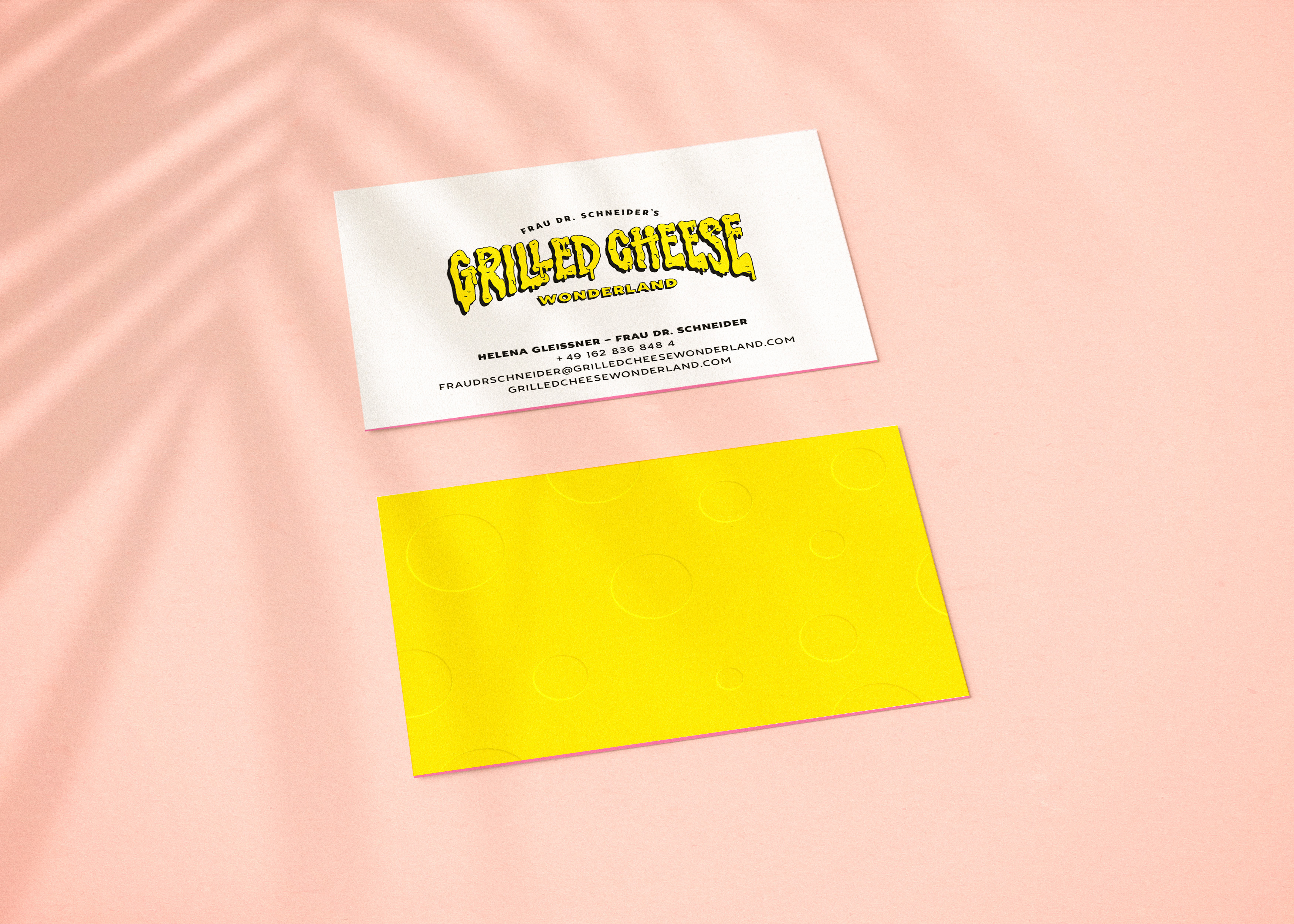
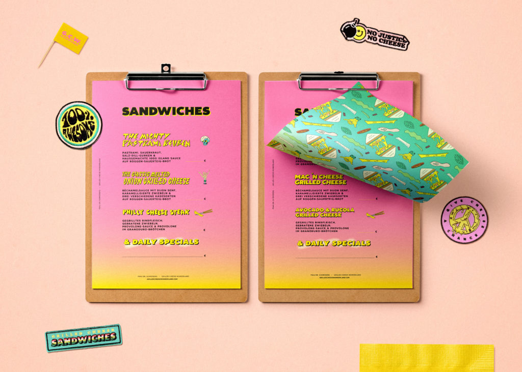
For the colour palette we chose GCW Pink and GCW Yellow as principal colours, supplemented by four secondary colors (green, turquoise, black & sand) to bring it all together a striking color range, so that the brands color code ensures high visibility even from a distance.
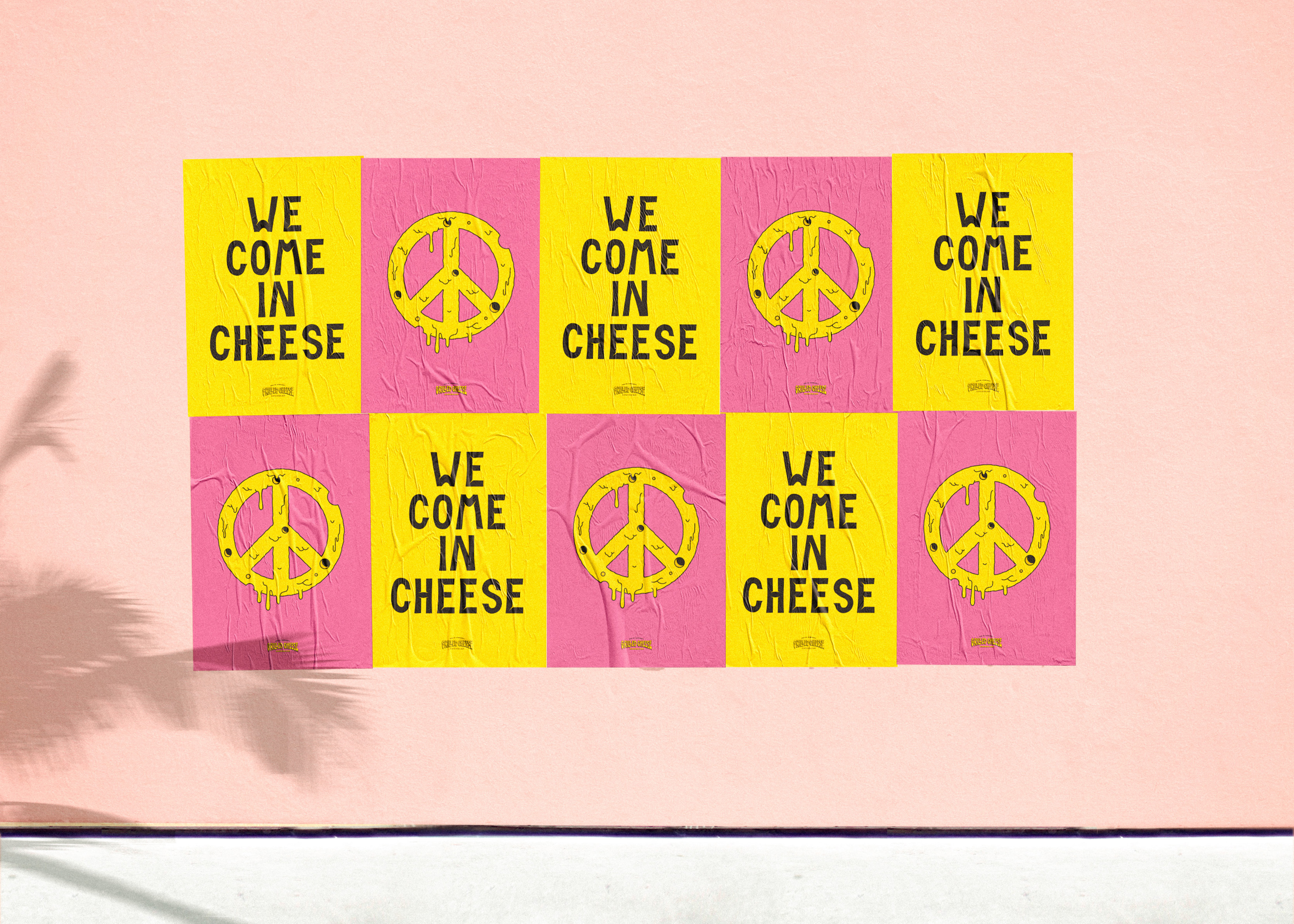
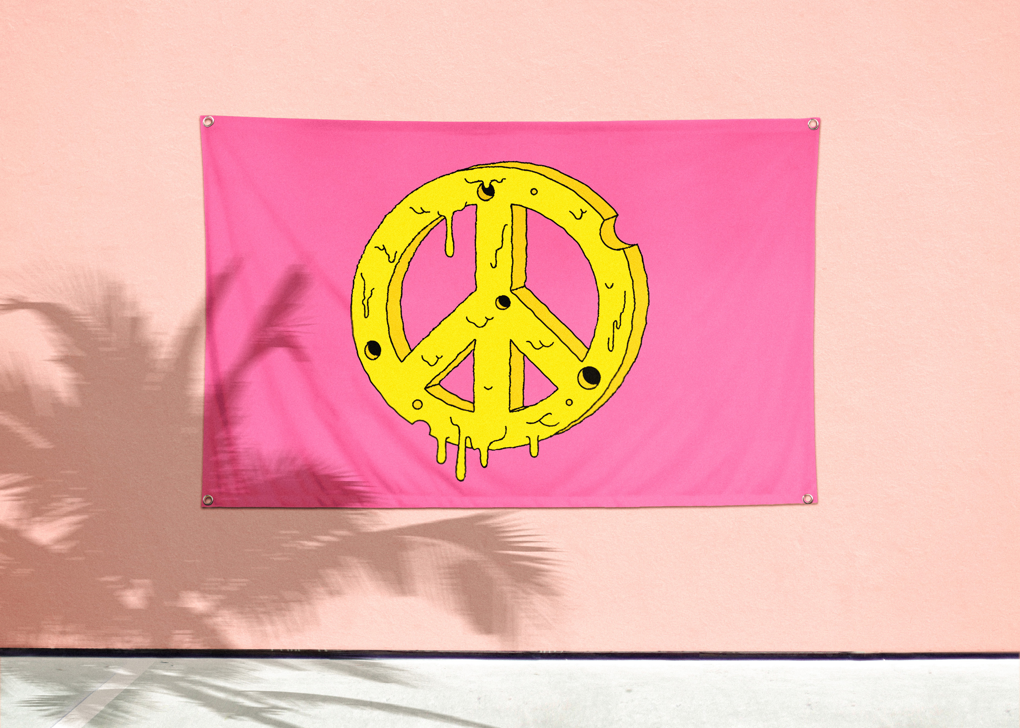
The 80’s surf punk inspired graphics are the core design elements of the identity and are shaping the overall look and feel.
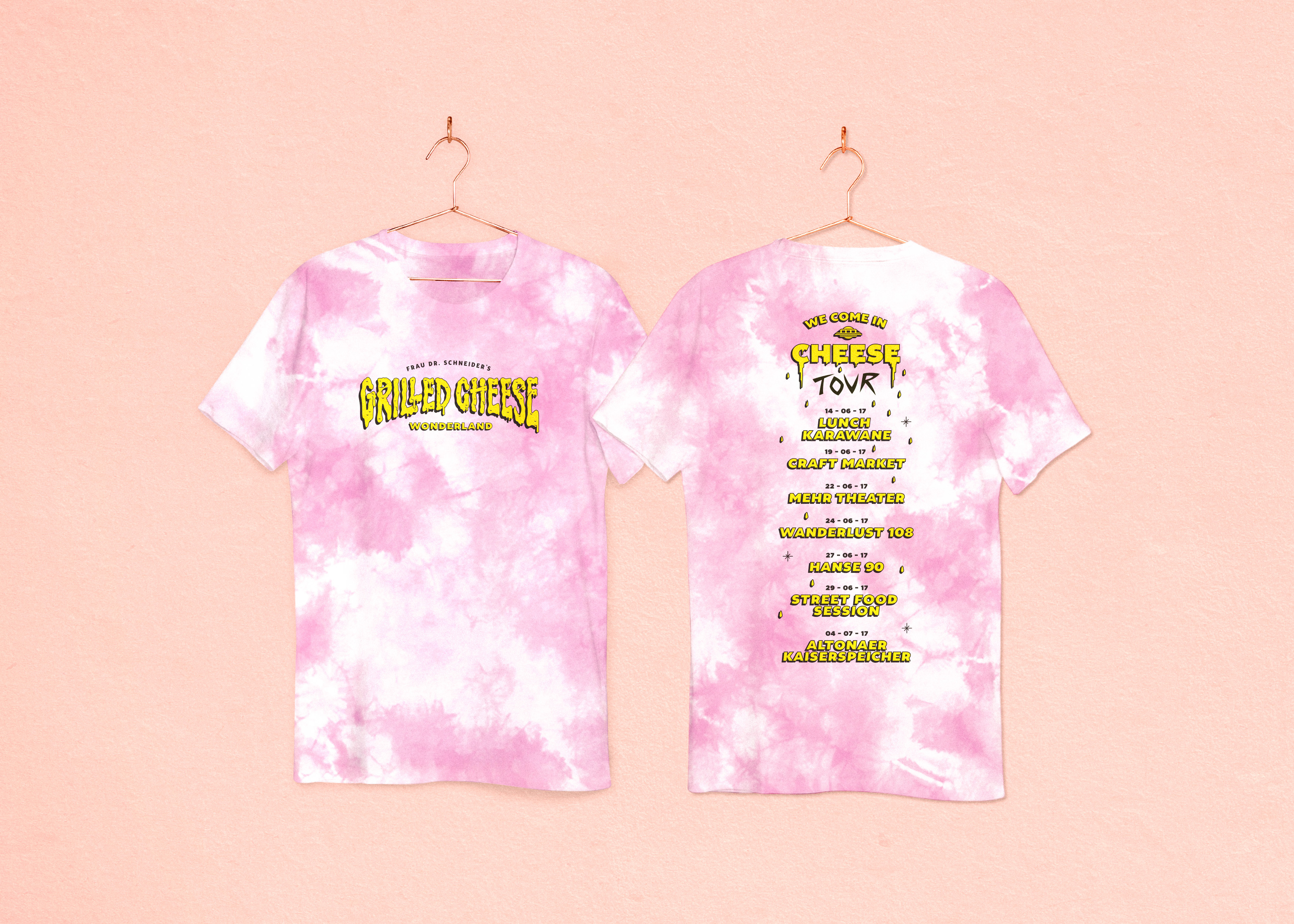
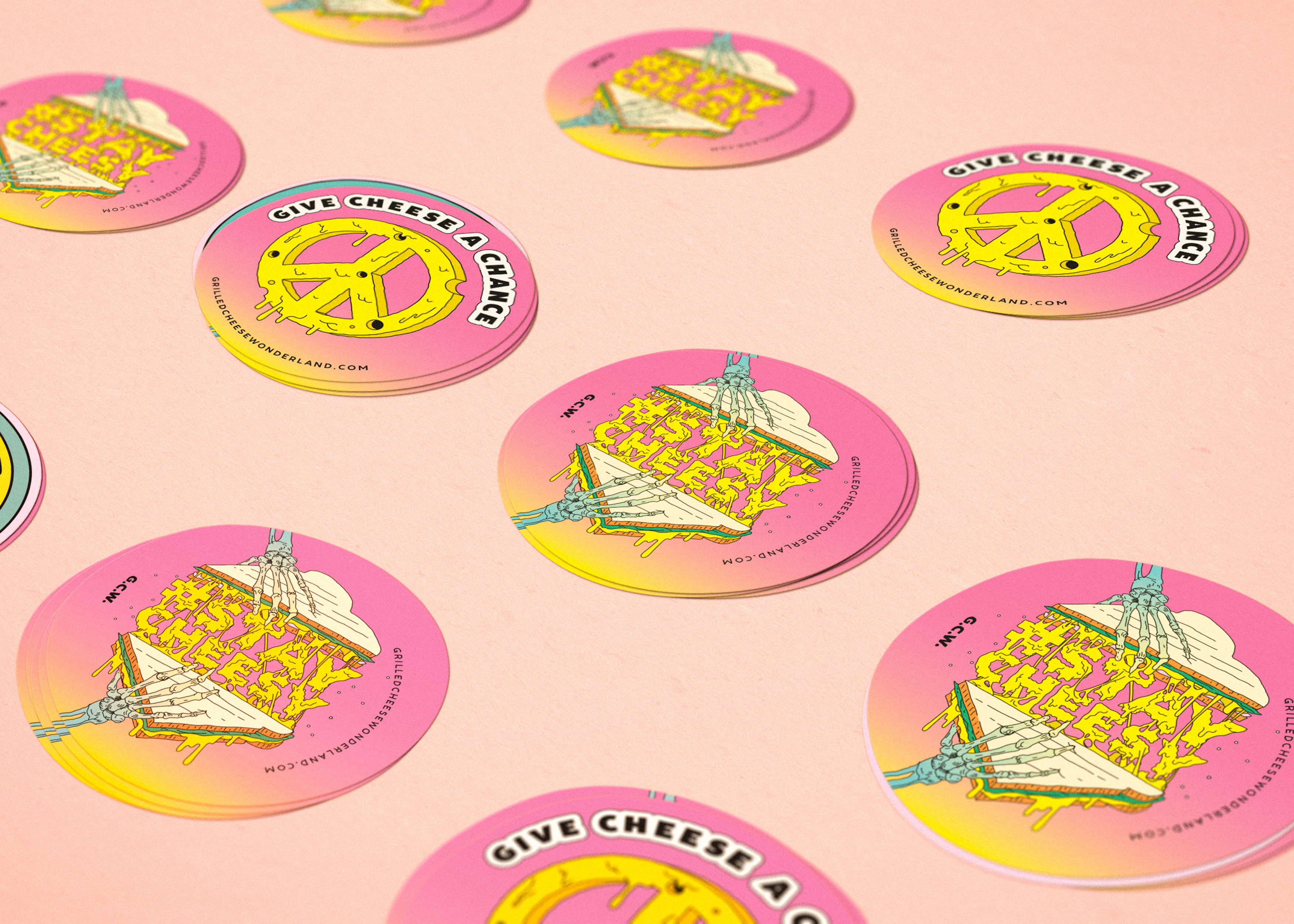
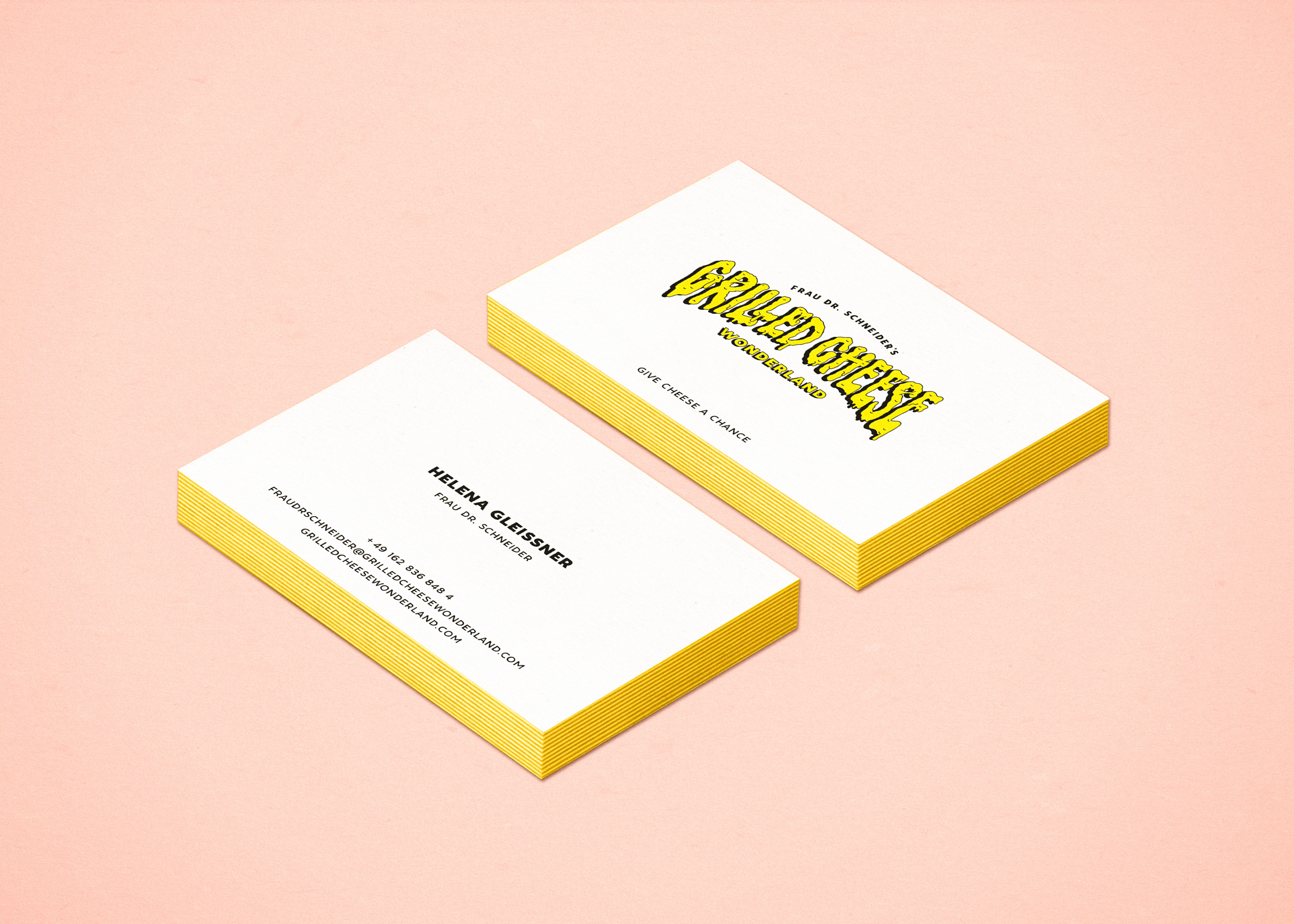
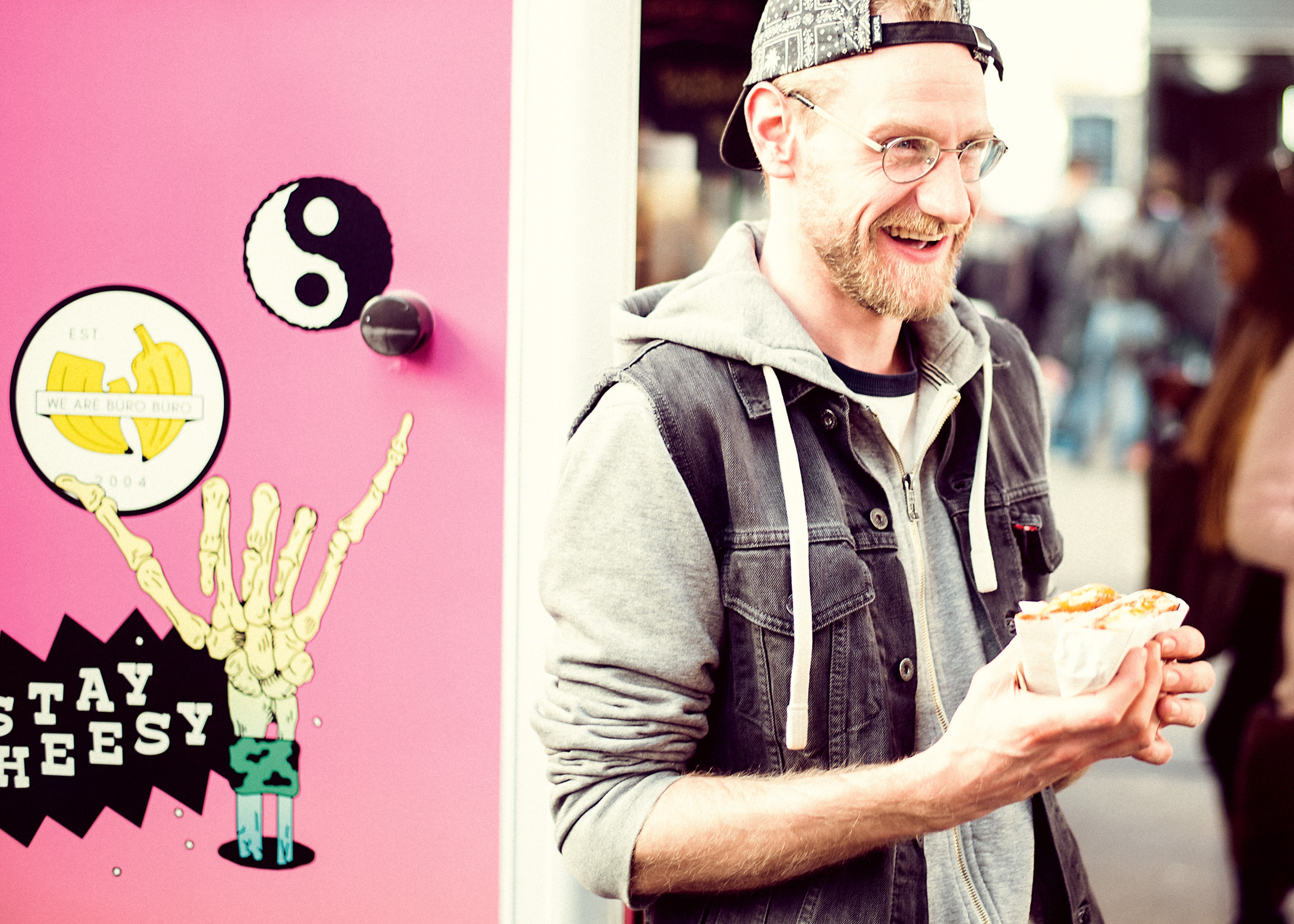
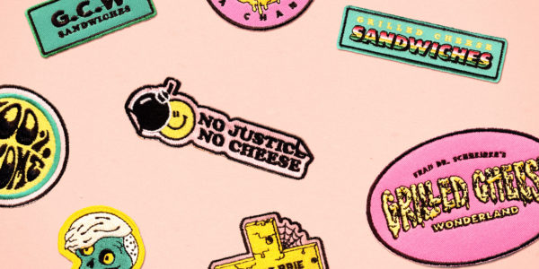
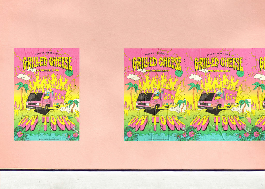
The outcome is a peaceful and positive wonderland with the food truck as a core piece of the new identity. The new branding is implemented on the complete business stationary and rolled out onto other communication devices like stickers, posters, flags, and merchandise products.
Branding for Frau Dr. Schneider’s Grilled Cheese Wonderland
Frau Dr. Schneider’s Grilled Cheese Wonderland
Did she suggest a certain approach or did you have free reign to experiment and be as crazy as you wanted to be?
Helena was really open minded for every idea or consideration we came up with. The only thing she insisted was a colorful and bold approach, otherwise we enjoyed complete freedom to create a design we believed in after developing the brand strategy together with her. In our opinion it’s not crazy at all. Maybe it would be a crazy rebrand of Burberry 😉
There are some really cool type treatments on the logo in particular, where did the inspiration come from for the colour palette? Its kind of 80’s right?
Yes, indeed, one could say that the whole look and feel of this project is inspired by 80’s and early 90’s skateboard and surf punk graphics mixed with pop elements.
The pink was a proposal of Helena, the rest of the color range was expanded during the work process based on our brand strategy.

Branding and illustration for Frau Dr. Schneider’s Grilled Cheese Wonderland

Branding and illustration for Frau Dr. Schneider’s Grilled Cheese Wonderland
Branding and illustration for Frau Dr. Schneider’s Grilled Cheese Wonderland
Branding and illustration for Frau Dr. Schneider’s Grilled Cheese Wonderland
Did you encounter any hurdles or challenges during the project?
Not necessarily during the project, but rather at the beginning. Helena is a truly good chef. There was a brief moment when we had thought about developing a clean and elegant design, but it was quickly clear that conventional didn’t really reflect the brand. So capturing the personality and attitude towards life and the spirit of the Grilled Cheese Wonderland gang became our focus.
We focused on capturing the personality and attitude towards life and the spirit of the Grilled Cheese Wonderland gang.
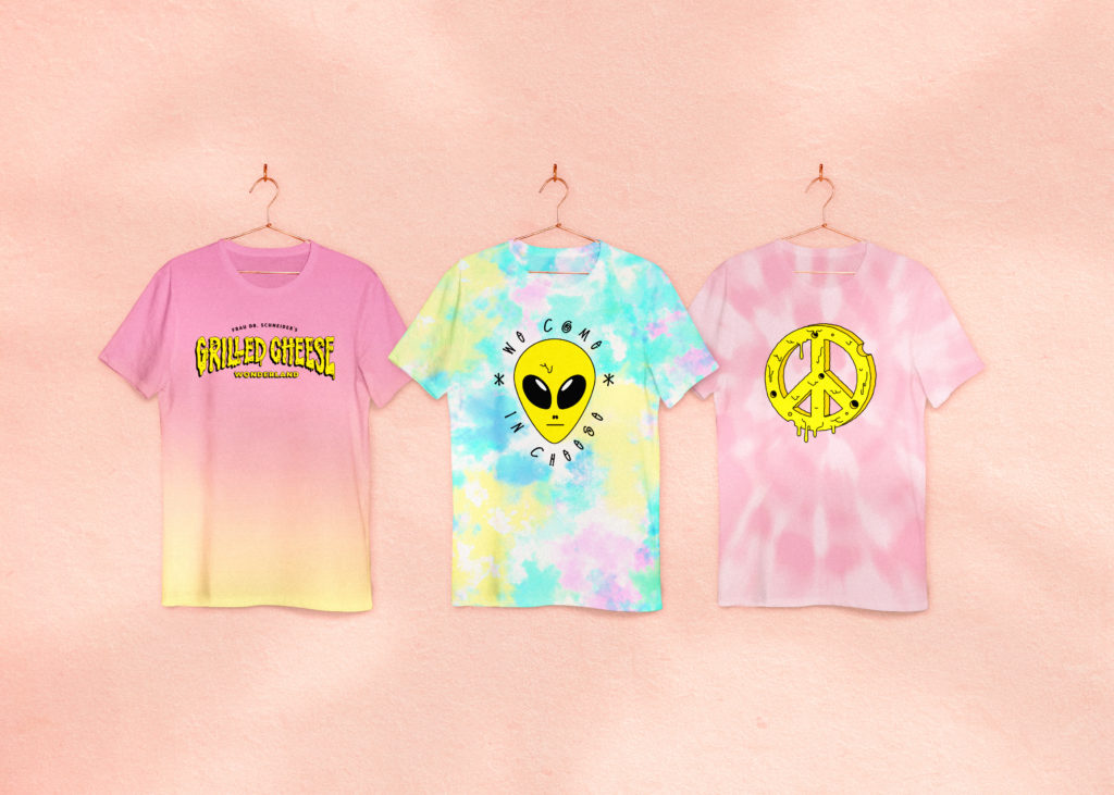
The final branding has been rolled out onto merchandise – tees, patches etc. Did this evolve as the project went on, or was it always part of the plan?
Yes, we also thought about how the staff could be dressed from the very beginning. Once the concept for the branding was finalised we immediately had these surf and beach inspired clothes in mind; light destroyed denim jackets or vests with patches, or these batik effect and dip-dyed t-shirts.

Branding and illustration for Frau Dr. Schneider’s Grilled Cheese Wonderland
Branding and illustration for Frau Dr. Schneider’s Grilled Cheese Wonderland
What do you enjoy most about working on projects like this?
We really enjoy close collaborations with nice people. People who dare to be different, willing to break new ground and show personality. There is always a safe path in design, and a wish to please everybody. Yet according to our experience courage will be rewarded if you go a different way.

Branding and illustration for Frau Dr. Schneider’s Grilled Cheese Wonderland
Do you know where the van travel to over the next few months?
During the next few months – “…the ugliest truck since Celine Dion” – as one customer called it – will travel music festivals and food markets of Germany.
Check facebook.com/GrilledCheeseWonderland for more details.
BÜRO BÜRO are represented by WE ARE GOODNESS